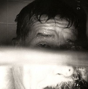
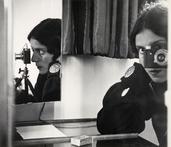
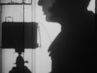
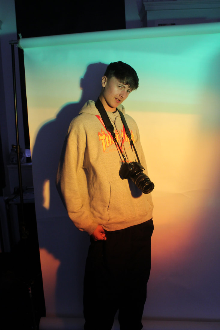
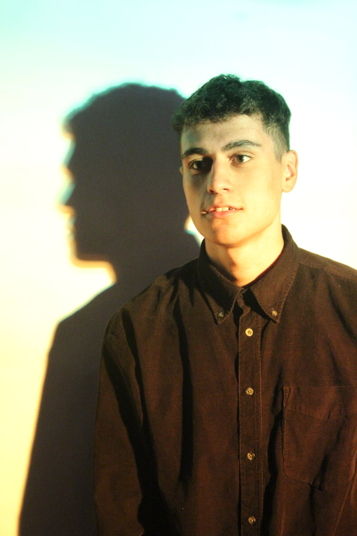
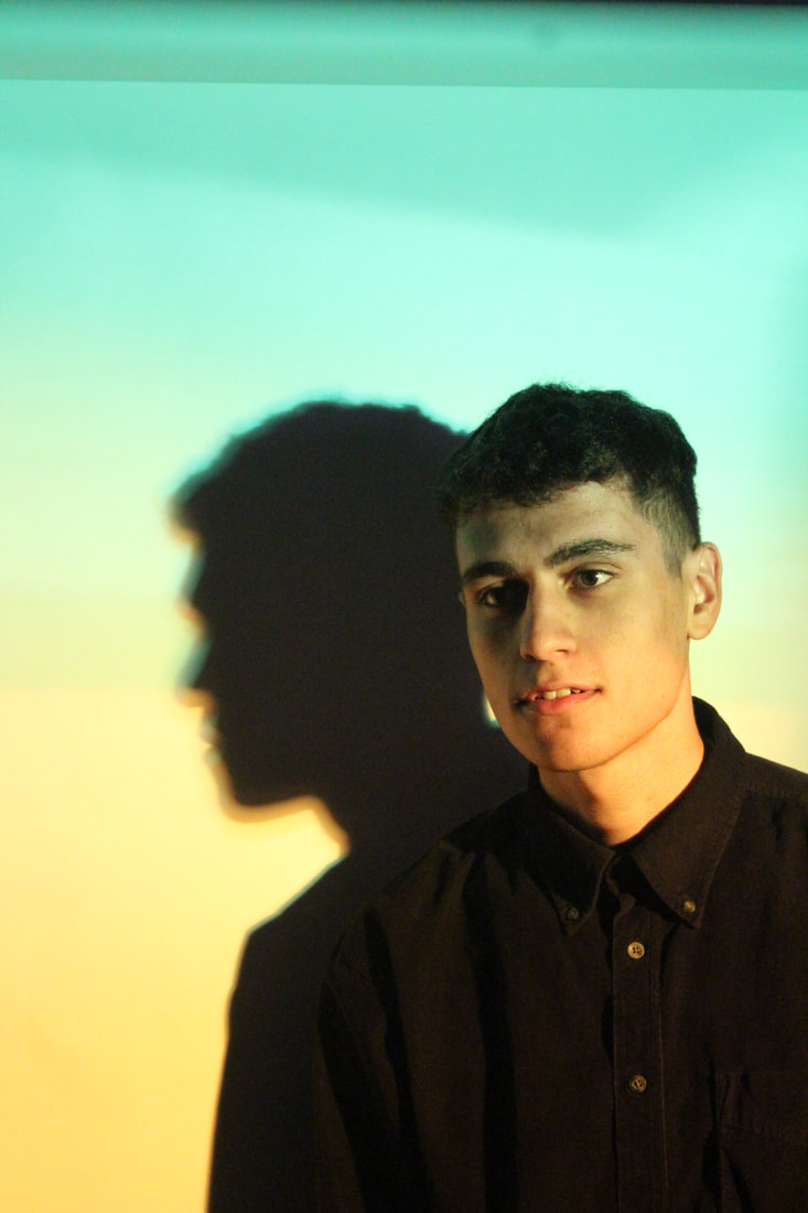
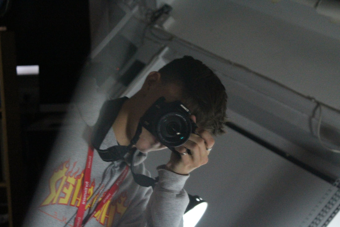
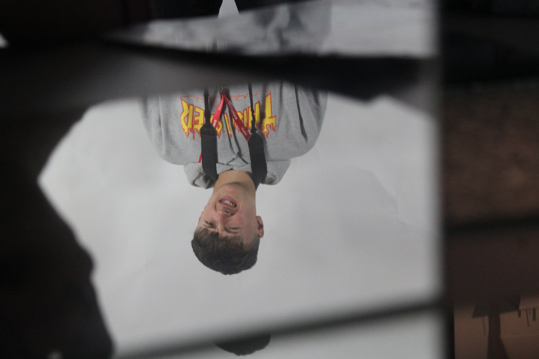
SELFIE
Here we were experimenting of 3 different types of selfies. Here you can see the pictures we took to match these. There is the Reflected Selfie, which I took in front of a glass pane window. This worked very well as The Obscured selfie, in which part of your face or body is covered by something. The Shadow selfie is when a light is shone onto a subject, and instead of capturing the subject, you photograph the shadow instead.
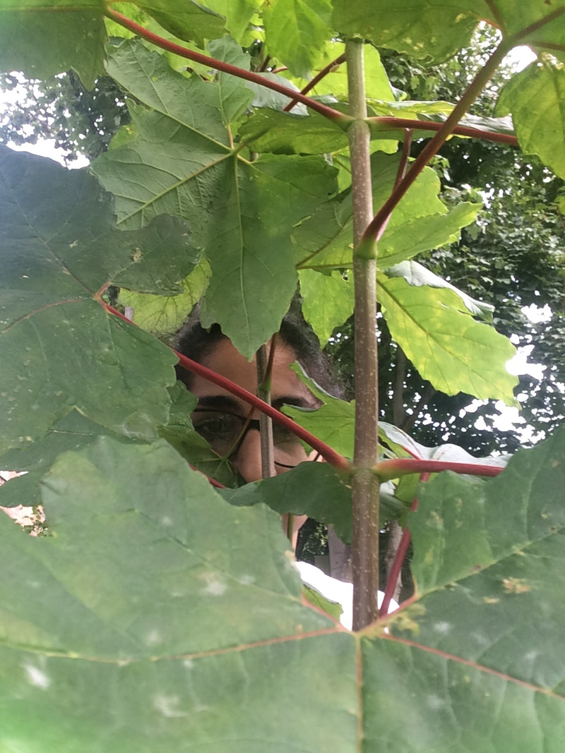
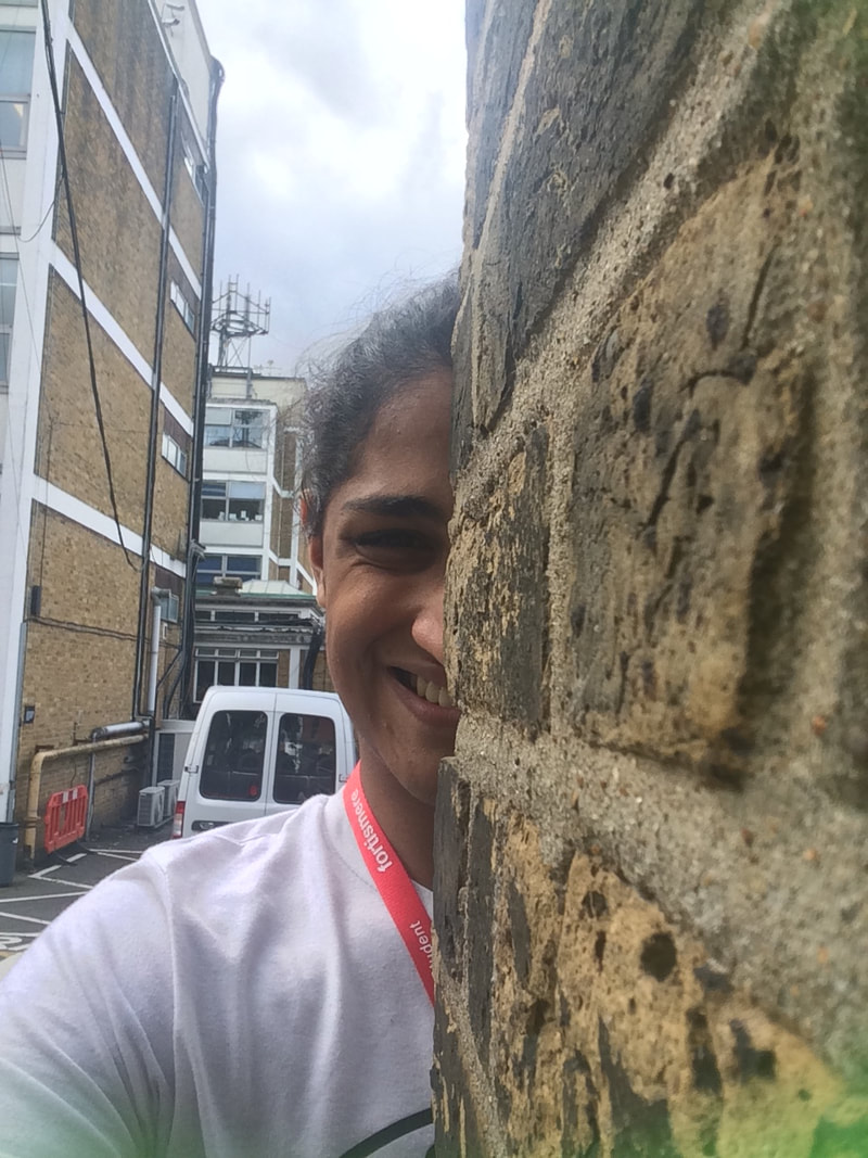
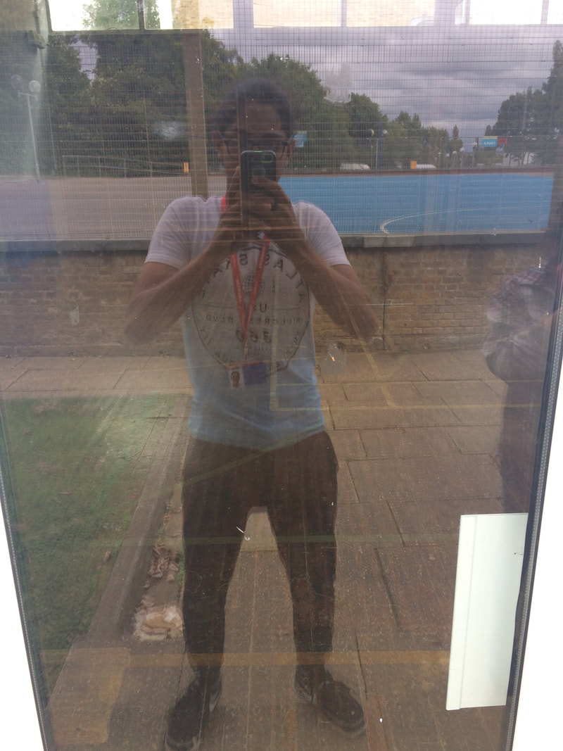
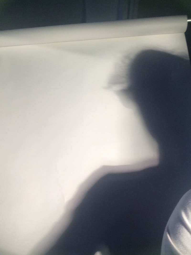
Types of Selfie from Left to Right: Obscured, Obscured, Obscured, Reflected, Shadow.
Underneath are the same types of photography from professional Photographers.
Underneath are the same types of photography from professional Photographers.
What are the photographers names?
PORTRAIT
This task was to essentially repeat the same styles of pictures we previously had, but instead of taking the photo of ourselves we took the photo of another person. This allowed us to be very creative with the methods we used to take photographs.
SHADOWS
Instead of just taking an ordinary show photograph,I draped different coloured plastic sheets over the light, creating a rainbow like effect, causing the shadows to have a very glitchy, almost 3d like effect.
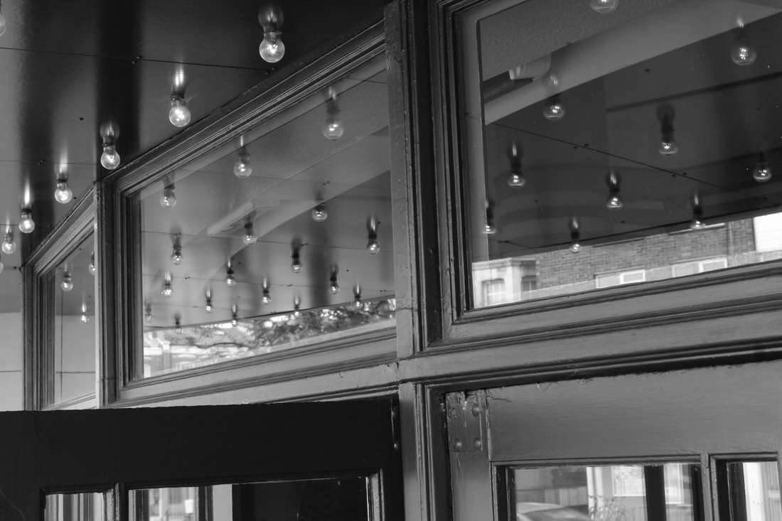
REFLECTED
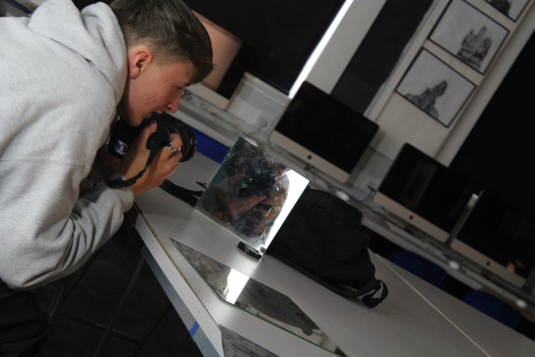
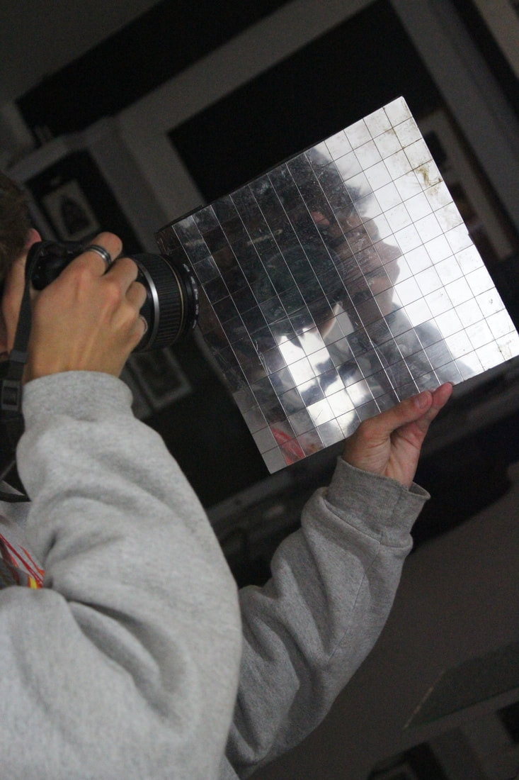
We used the mirrors available in the studio, and lined up one or two in order to catch the correct line of sight where it looks as if a normal image has been taken.
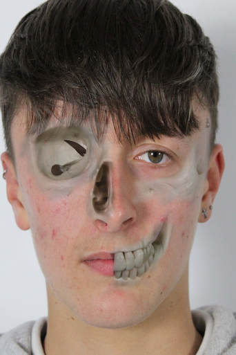
OBSCURED
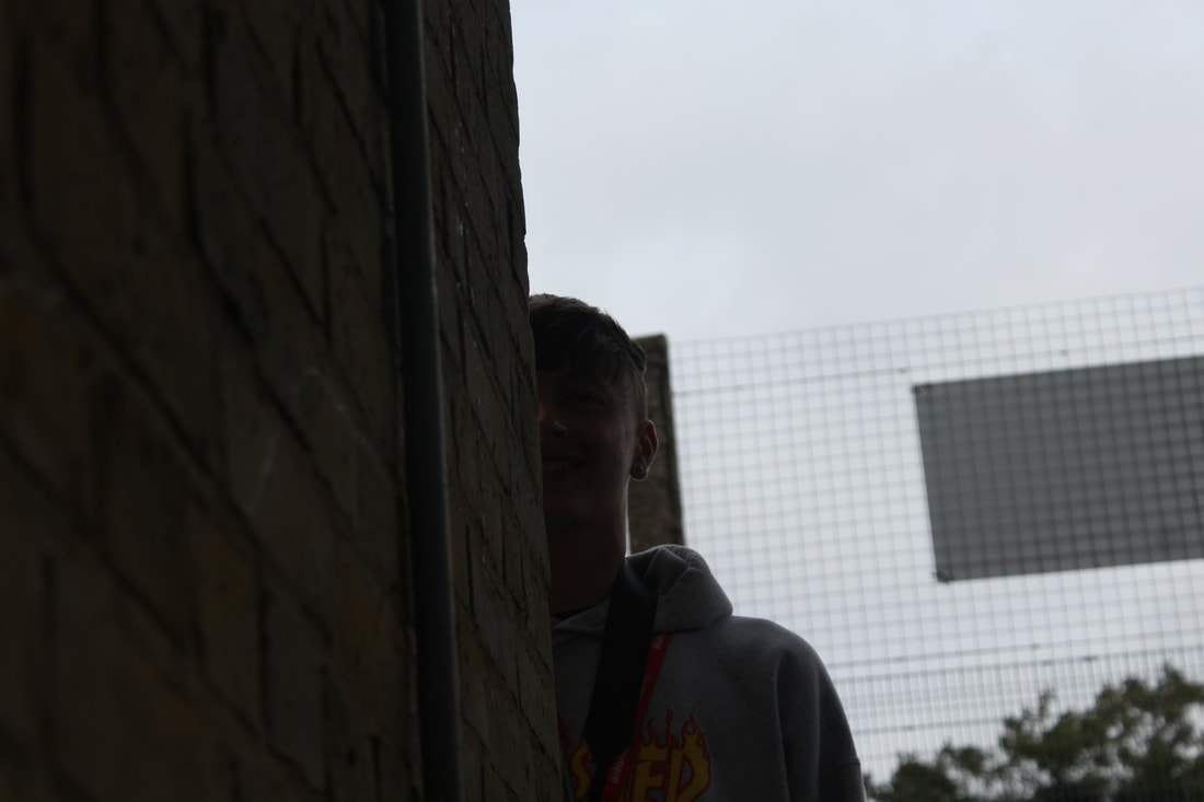
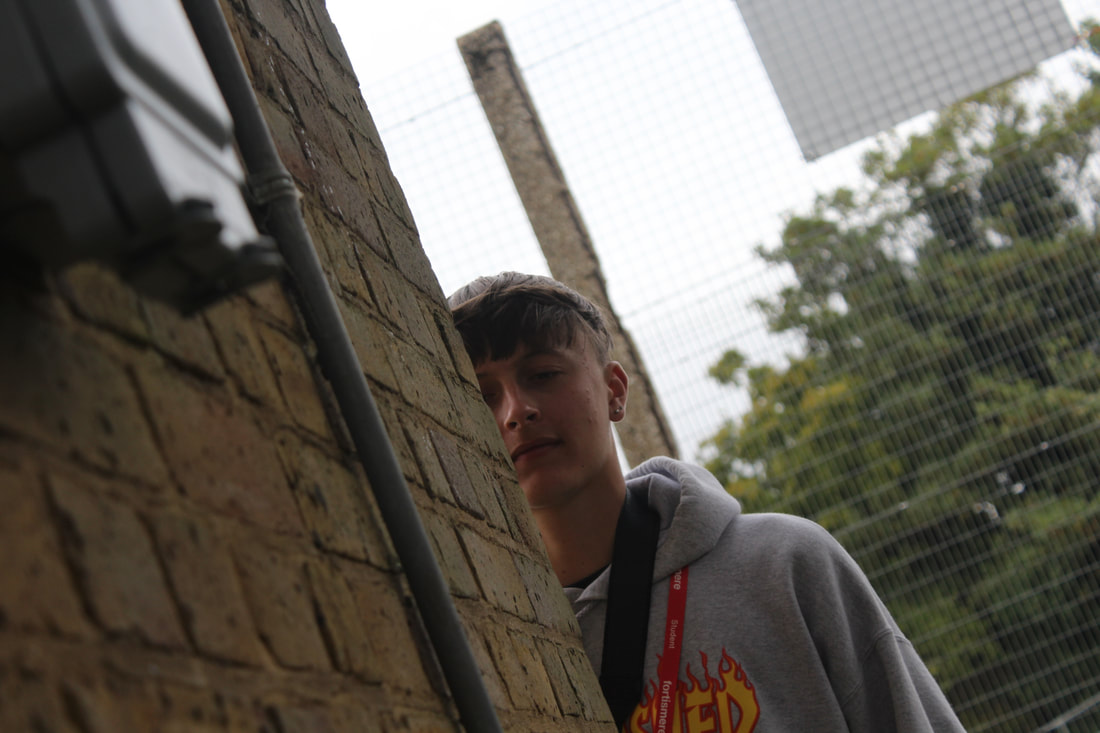
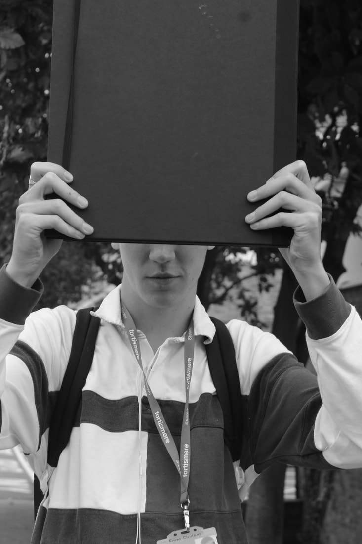
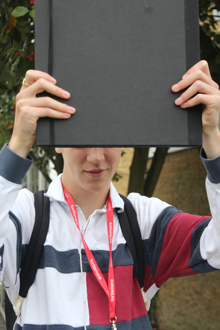
Taking this outside, we were able to capture the different elements in nature, such as the trees, and the buildings. These pictures were not difficult, but they had a certain blockiness to it, as all of the images used to obscure the faced are straight, rather than curvy. The black and white picture was taken as a mistake, whilst on the Creative Auto Monochrome setting, but turned out to be a happy accident.
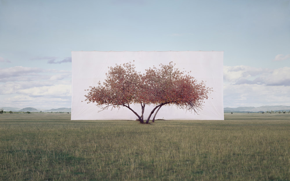
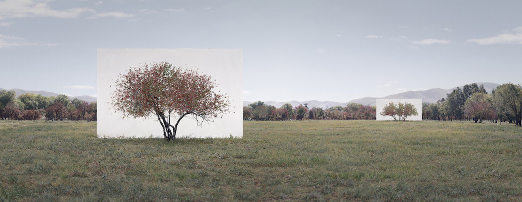
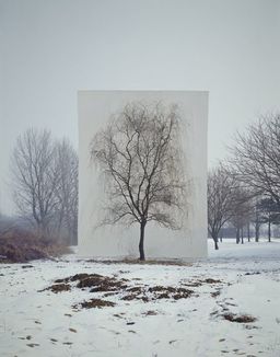
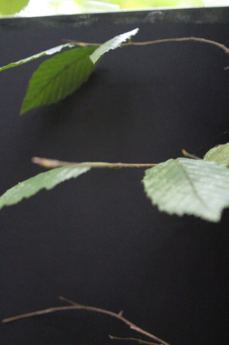
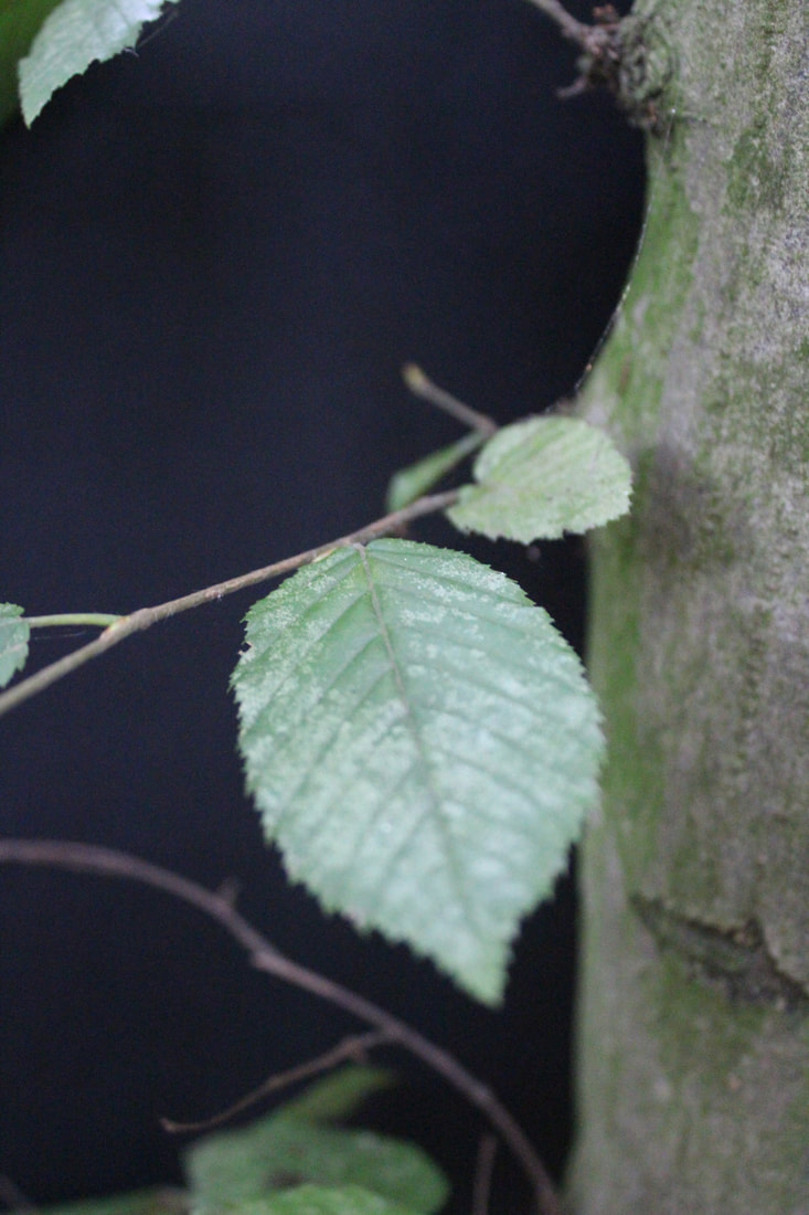
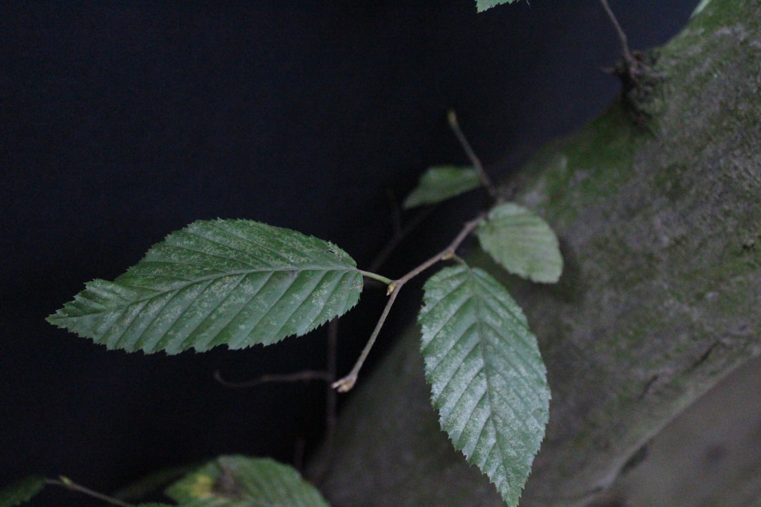
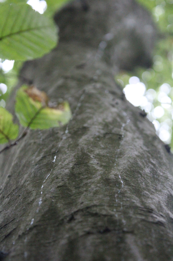
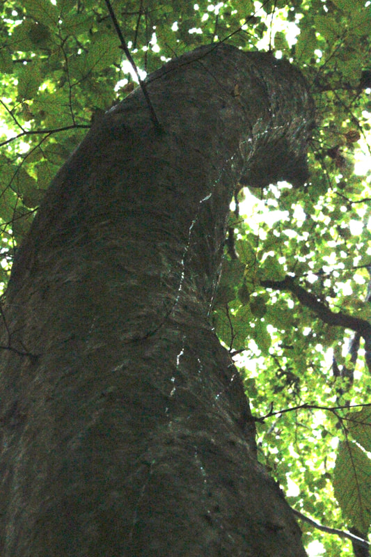
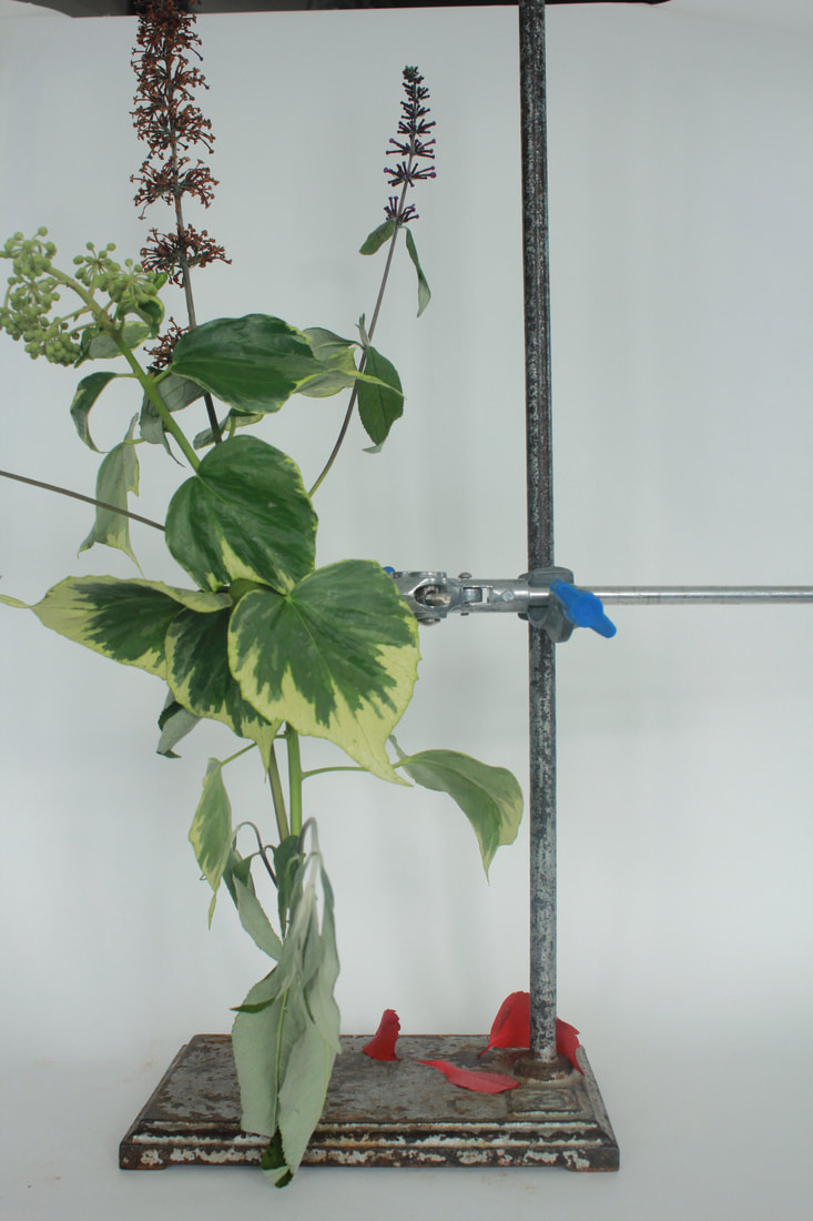
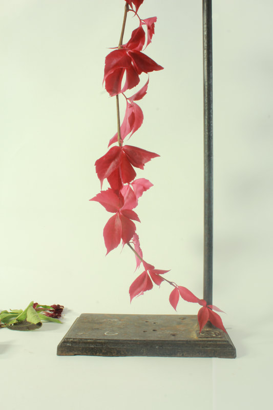
STRUCTURE IN NATURE
Myoung Ho Lee is a korean photographer that is known for separating pieces of nature from their surroundings. He only takes 4 photos a year, an they require a lot of equipment such as cranes , helicopters and dozens of people to help. He also notoriously photoshops his photos to obscene levels to get rid of all of the crew and equipment. However, in the end, he creates an image that can not only be described as magical, but is a feat in itself. Here are some of his photos below.
|
|
|
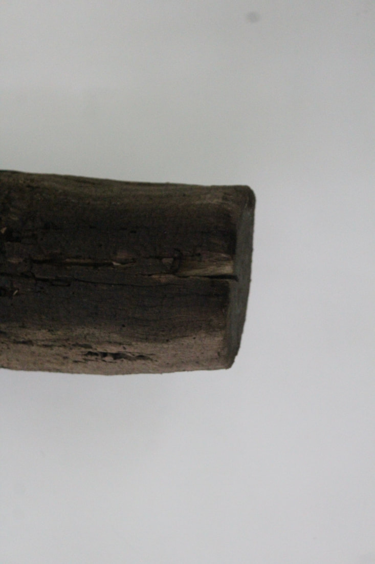
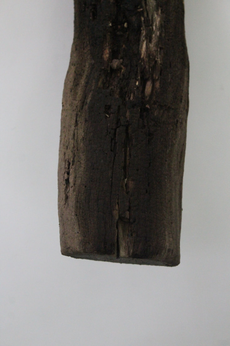
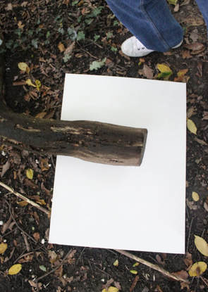
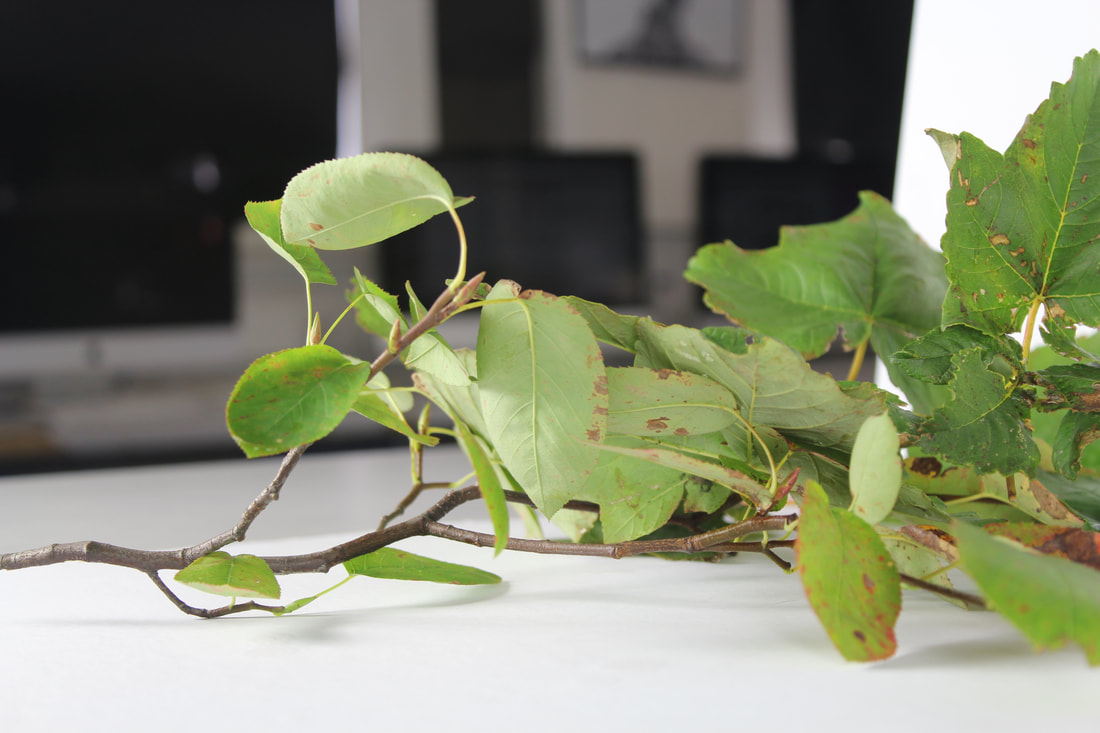
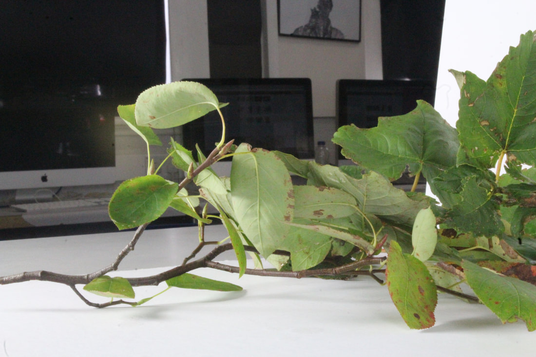
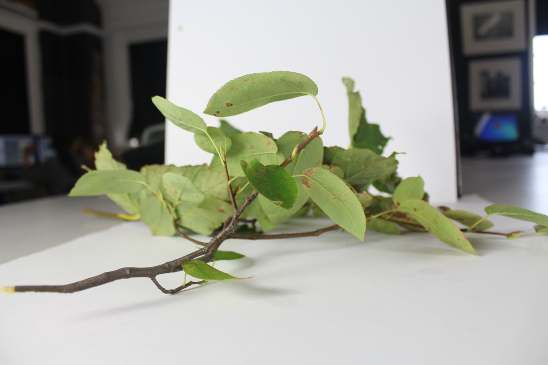
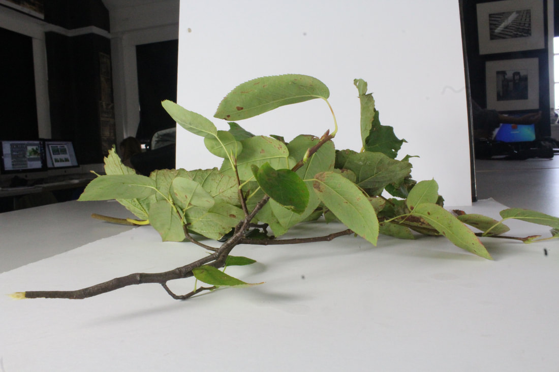
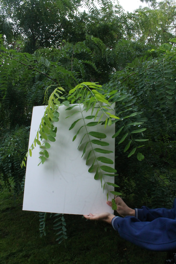
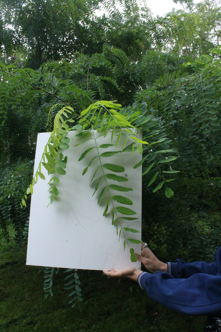
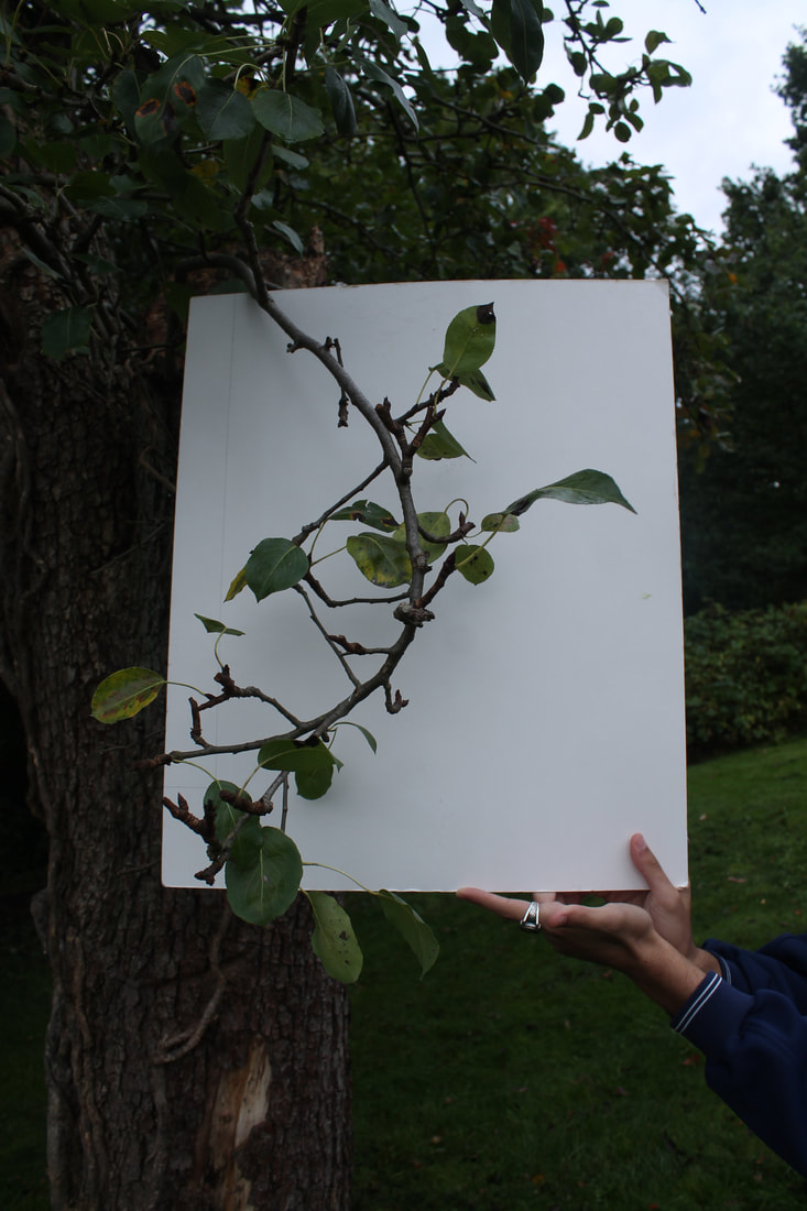
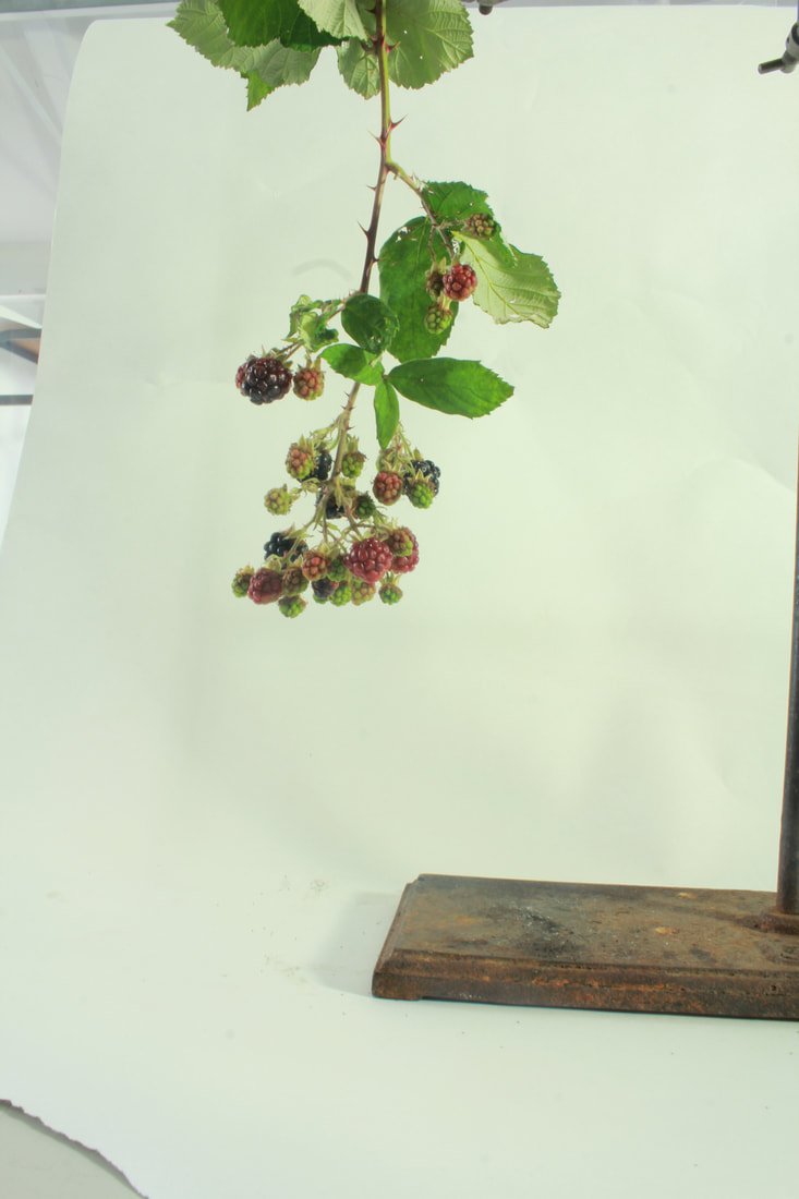
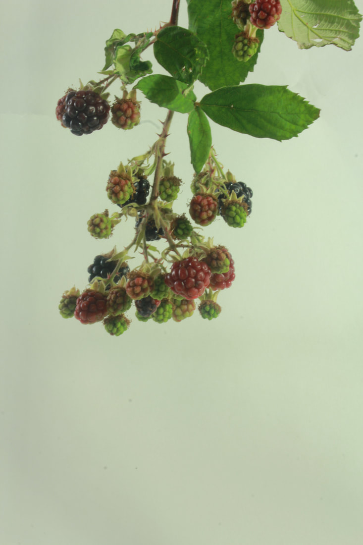
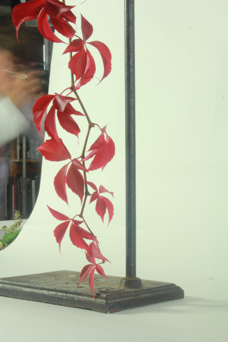
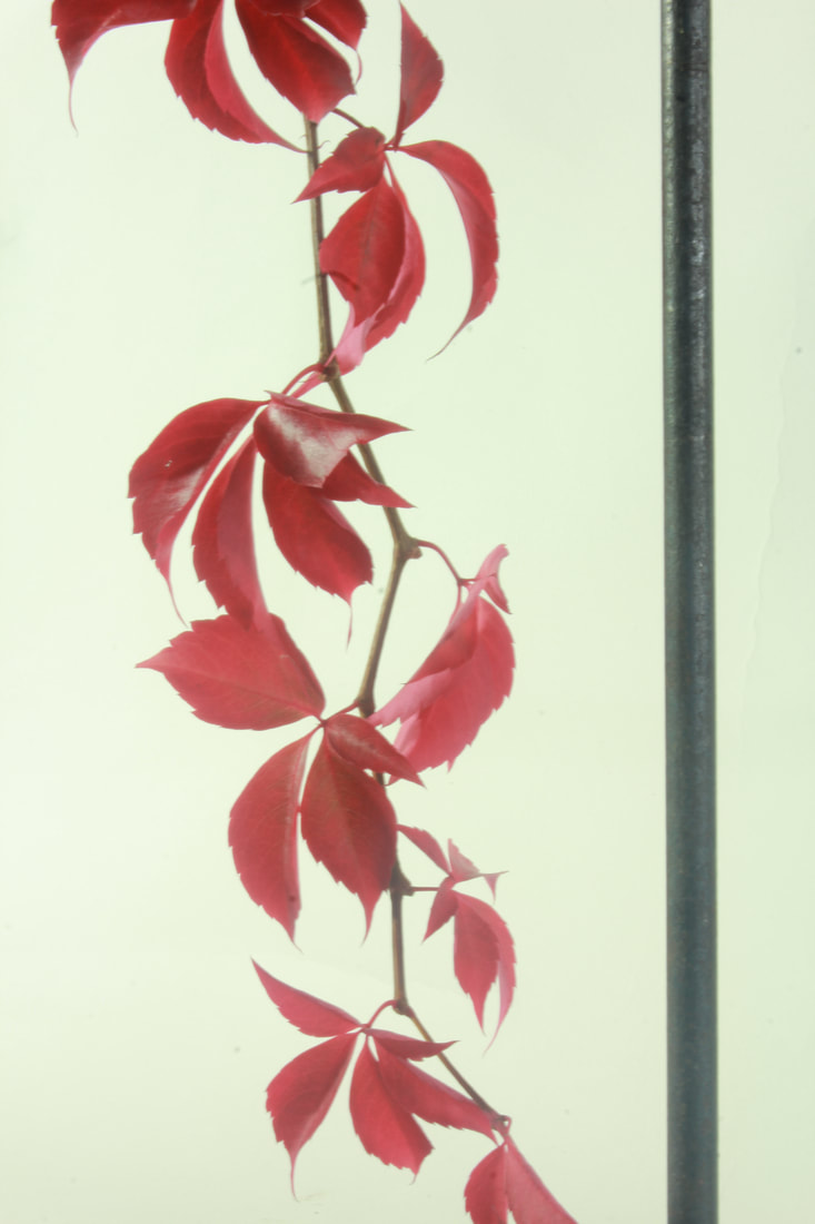
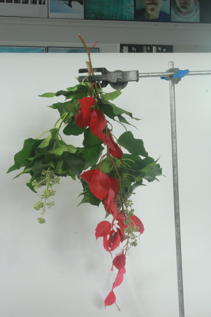
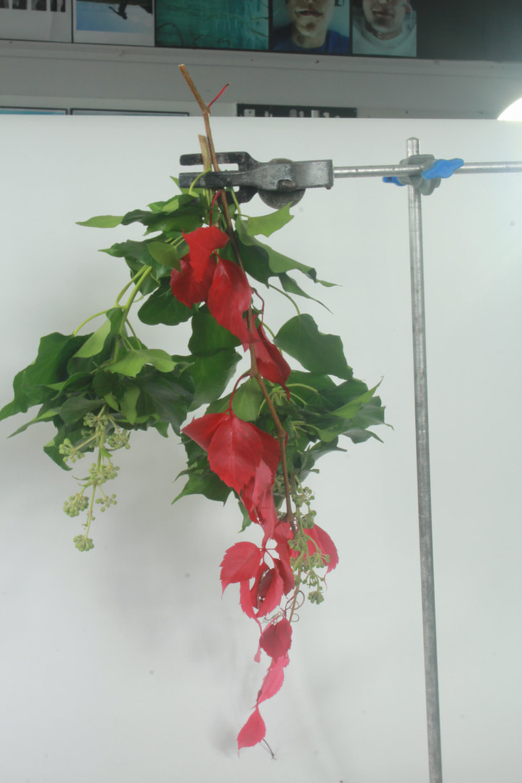
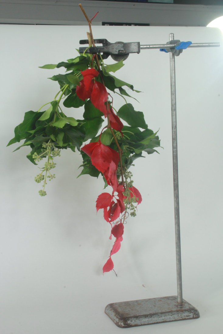
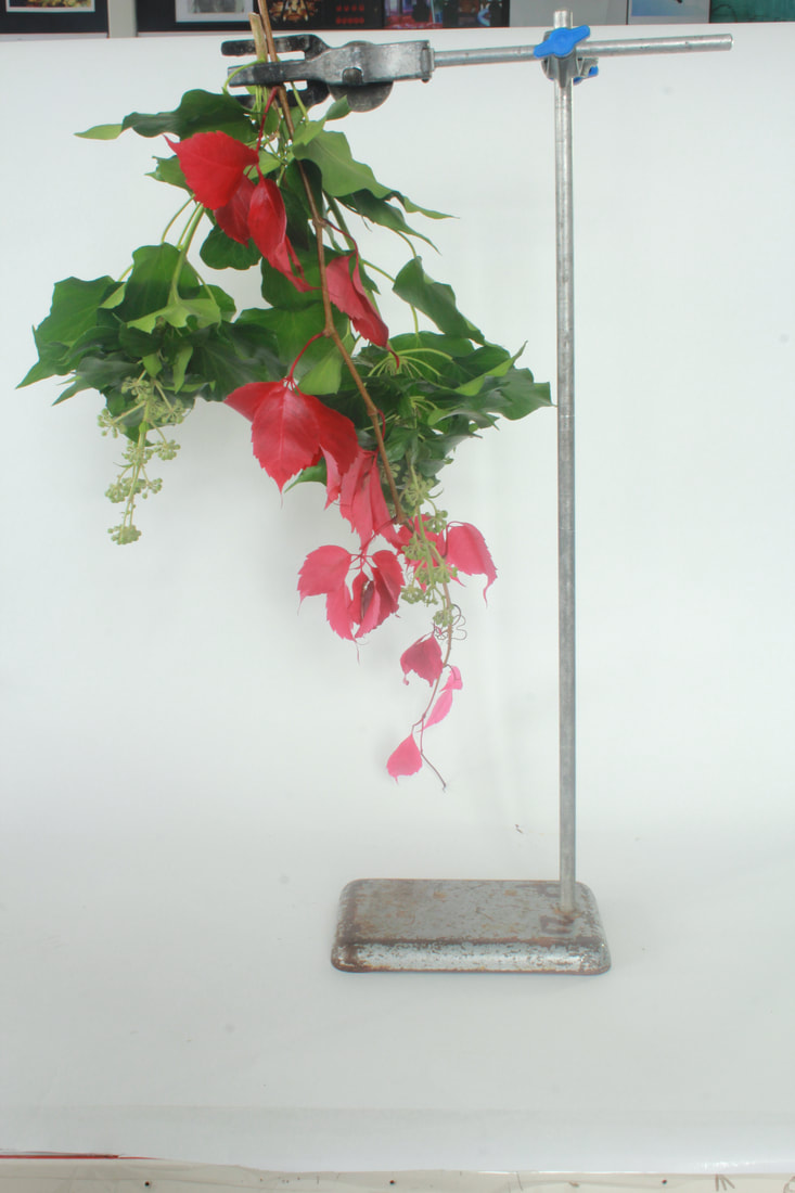
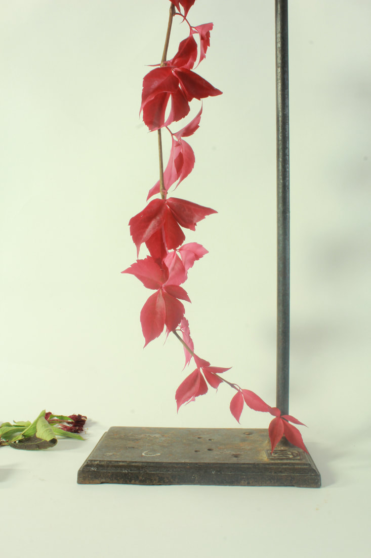
Underneath is my response to Myoung Ho Lee's work. I obviously didn't have access to the equipment he uses, so I had to settle for a piece of paper behind the object of my choosing. This makes things a lot harder, and you can see the difference in production quality. I also decided to use black card, to see if this made any difference in the final product. It had some effect...which is neither good or bad.
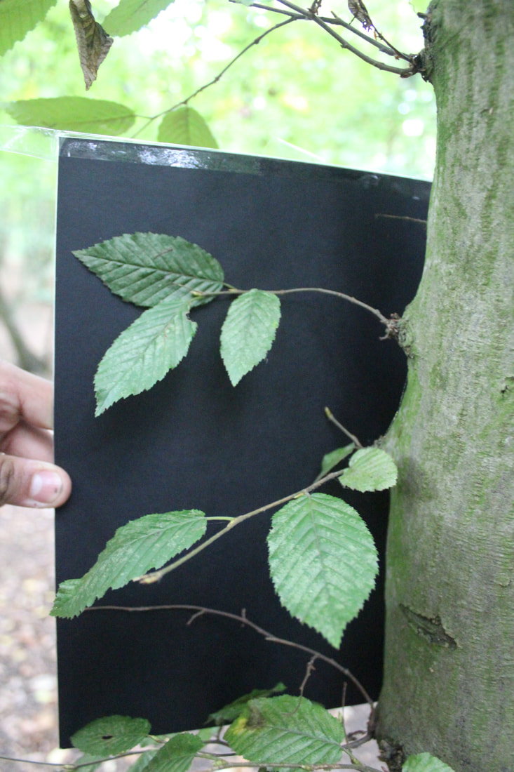
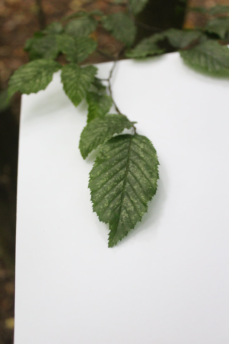
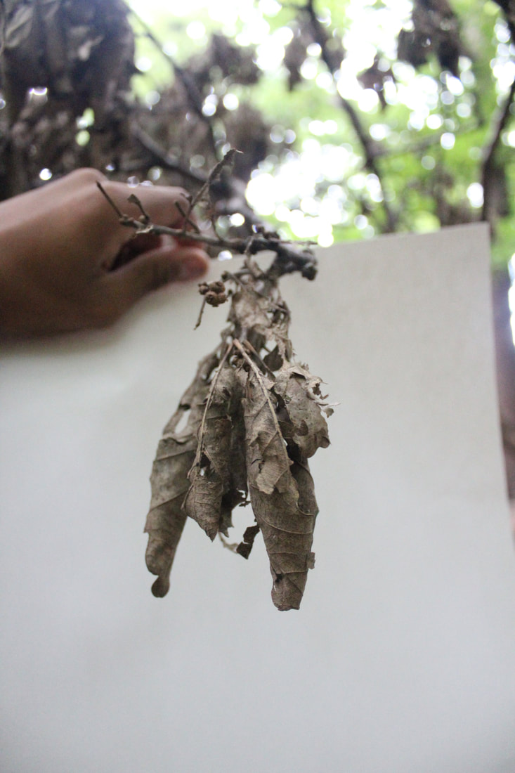
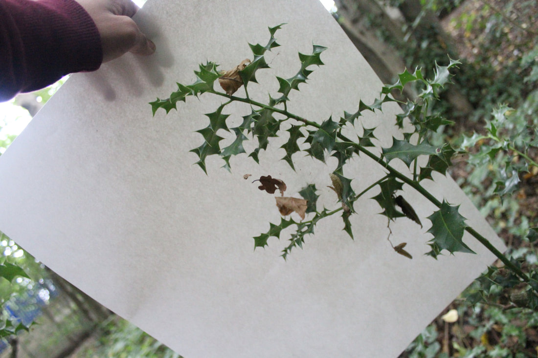
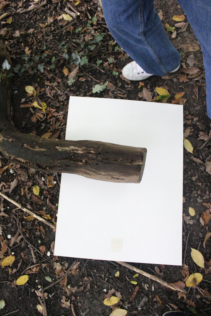
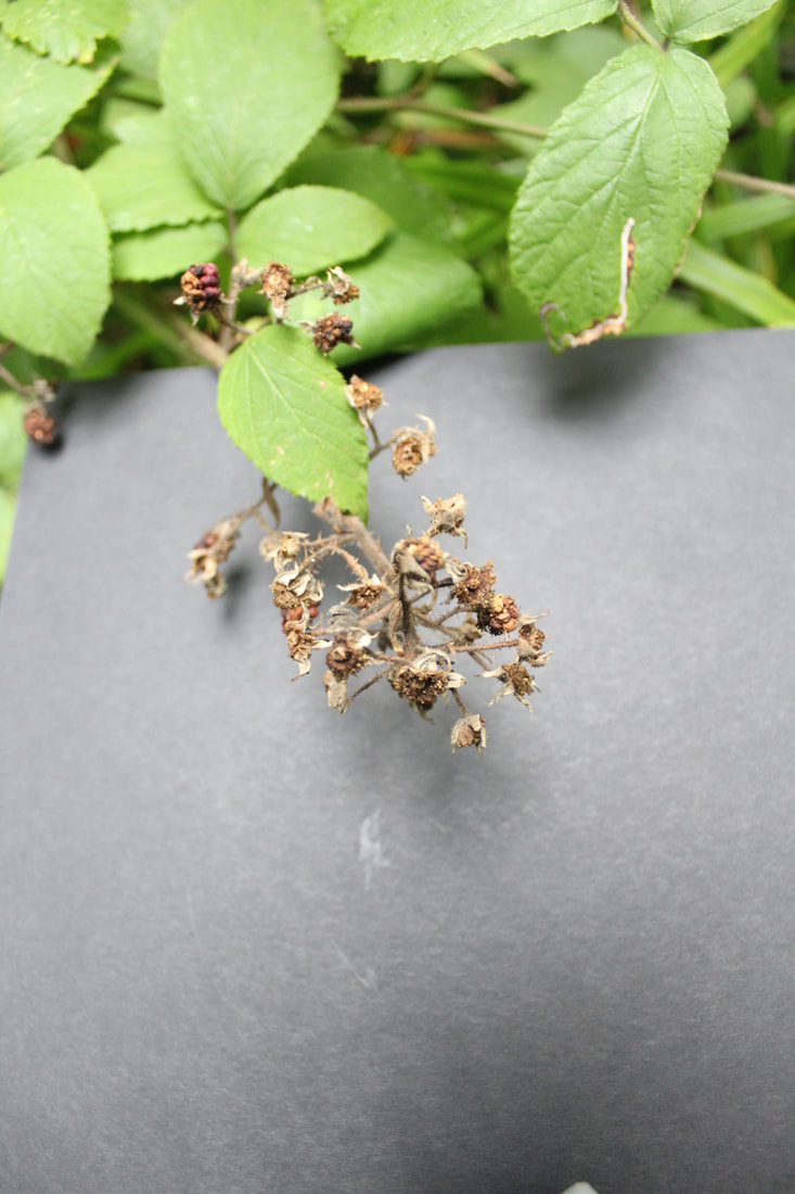
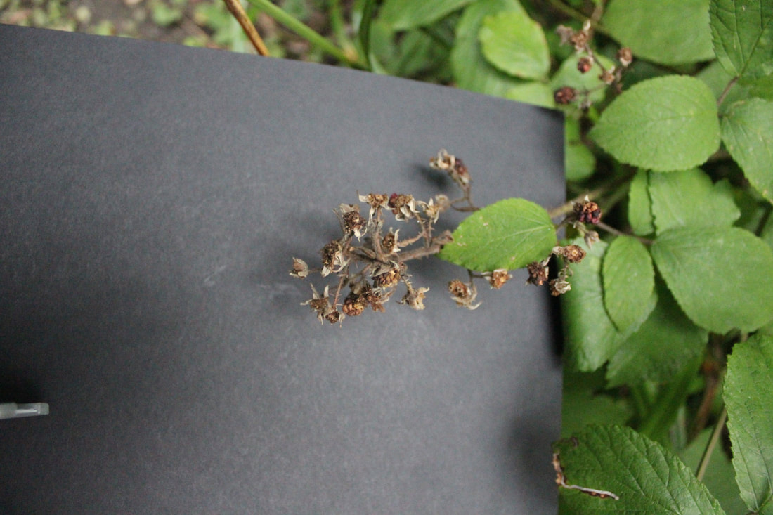
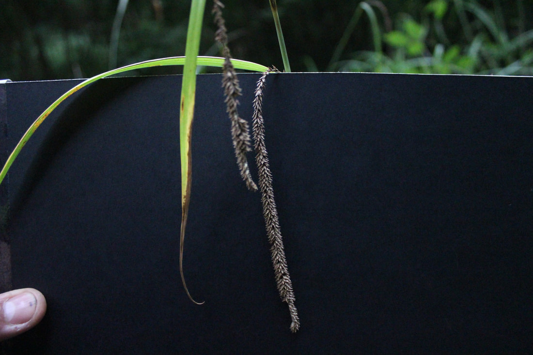
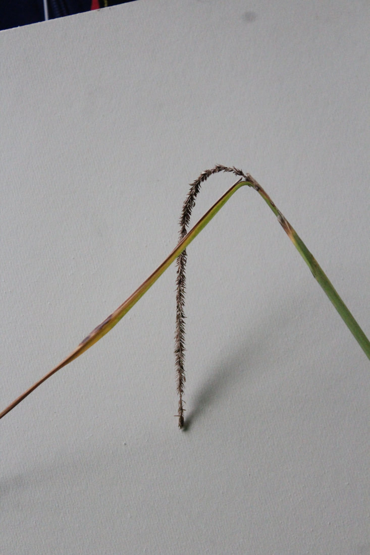
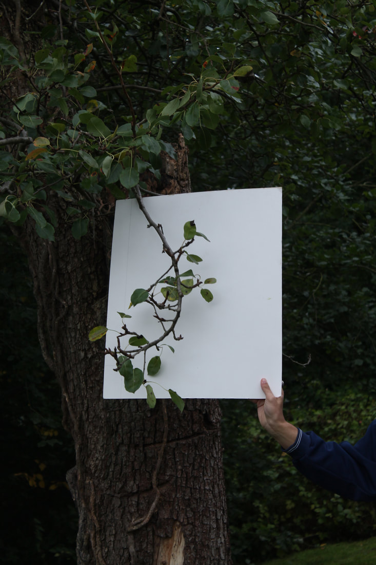
This is the image that I liked the best. cropped out the sides and back as you can see someones fingers and the different marks on the piece of paper I took this into photoshop,and made the background a uniform colour, allowing for a gradient of light to pass through. This is all the post editing i did for this photo. I liked it for its simplicity, and how the crisp colour of the subject shows against the dark background.
|
|
|
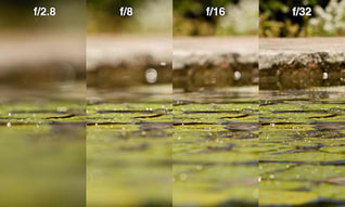
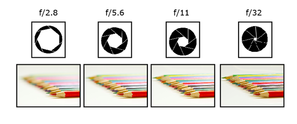
APERTURE
Aperture - Aperture is how far the hole in the lens opens. For example, f5.6 is when the lens opens the most, and the hole leading to the sensor is the biggest, letting the most light in. f22 or higher is when the lens is the most closed, and the hole to the sensor or film is the smallest, letting the least light in. The numbers are in reverse to the hole size. Bigger f number means smaller hole, and smaller f number means bigger hole.
|
|
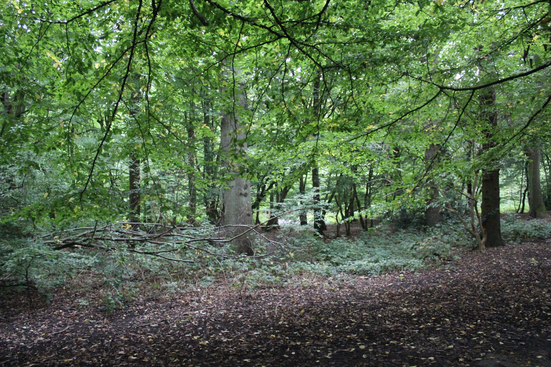
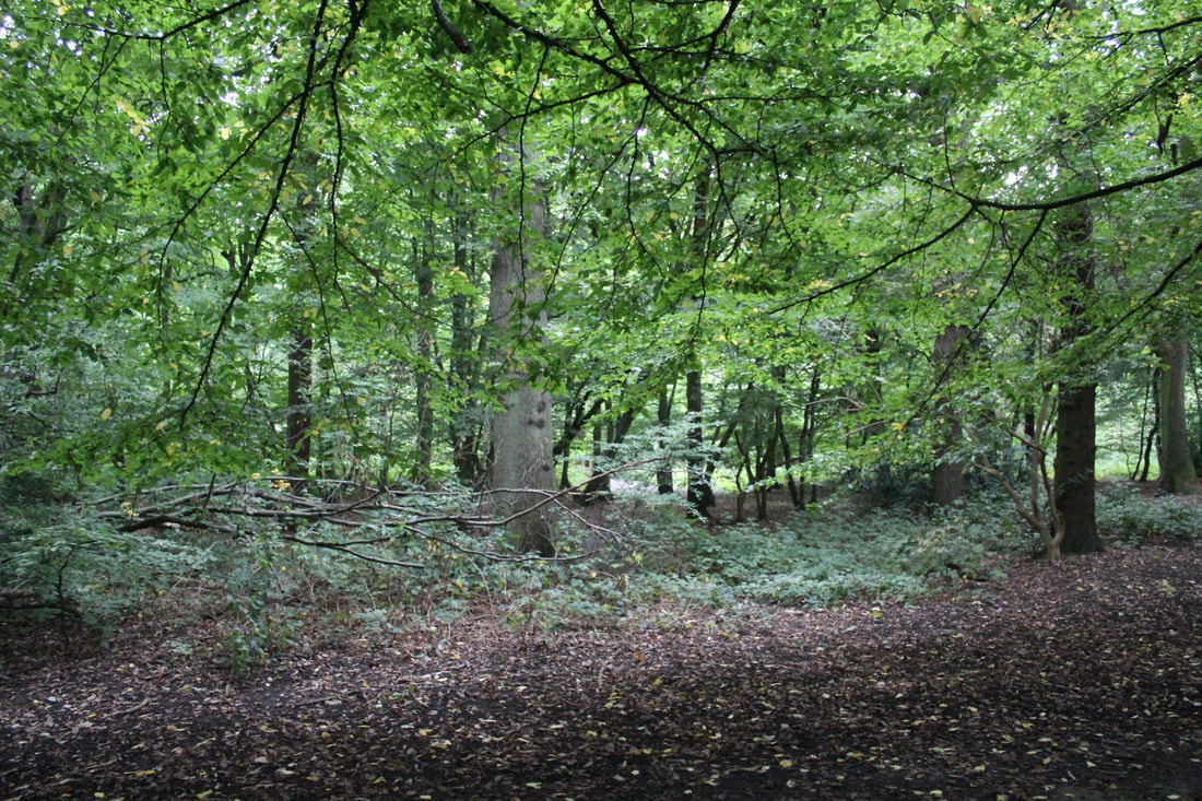
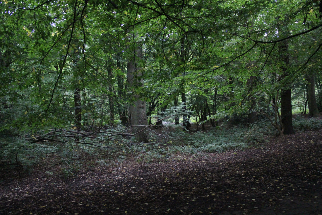
Underneath are the photos that I managed to take. The bigger two were take in Coldfall wood. I only managed to get two useable photos from Coldfall wood, it started raining and we had to leave. Once we had retreated back into our studio, I took some photos that were lit by the studio lights and using a tripod.
|
f5.6 (unedited)
|
f22 (edited in post)
|
Second Response
For this second response, I had to take the same 'Structure in Nature' photos, but this time, I had to use my knowledge of aperture to enhance the photos. I took most of the photos twice, once with a low f number, and once again with a high f number. This allowed me to play with the depth of field in each photo, making it
STRUCTURE IN NATURE
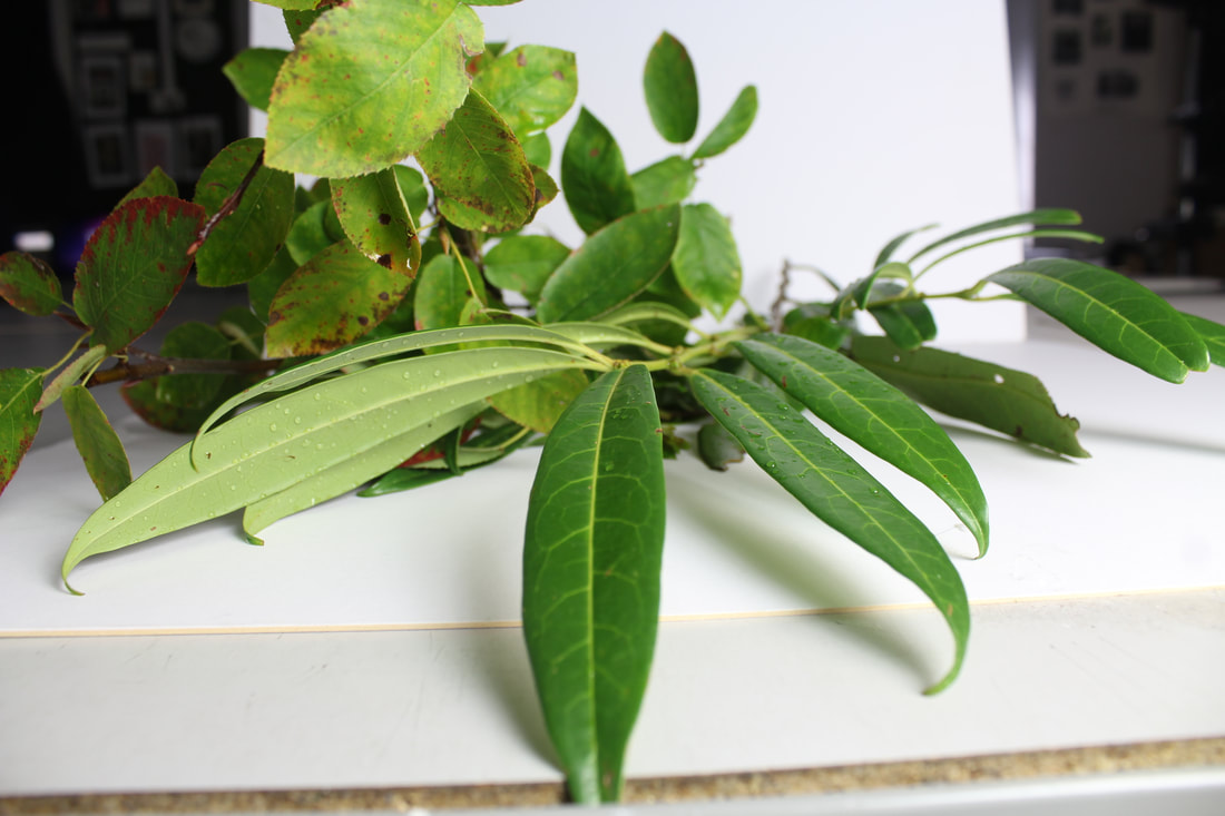
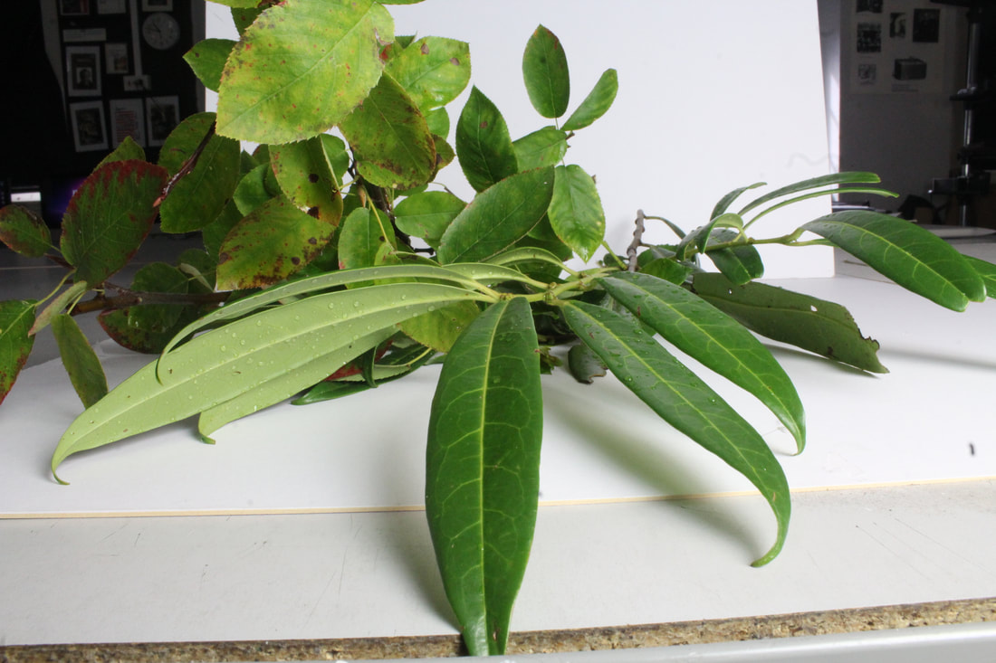
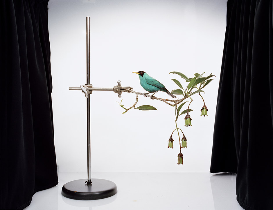
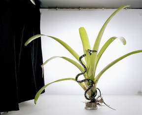
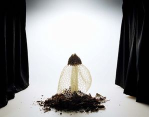
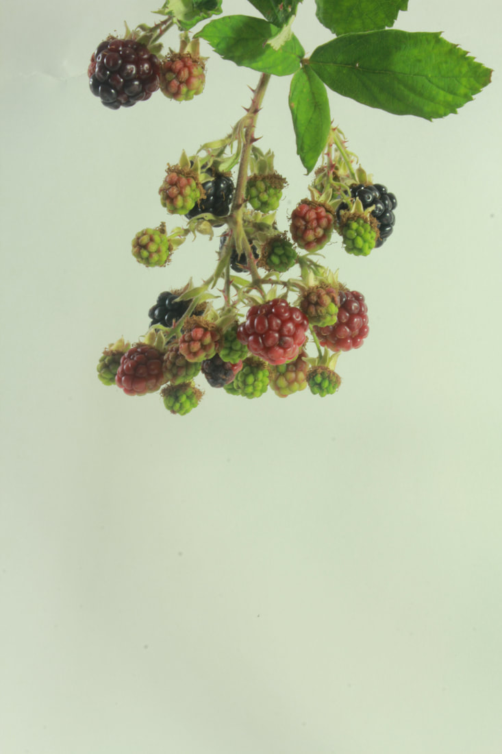
Today we replicated the ideas of photographer Sanna Kanisto. She is a photographer who every year goes to the rainforest for 2-3 months to take photos. She stays at Scientific stations and uses their equipment to take photos. She has been doing this since 1997. She takes a lot of photos, sometimes with herself in the frame. Here is an example of her photos.
|
|
|
She uses a white background for all of her photo, as it separates the subject from the actual habitat, whilst still maintaining it as well. The photos are never just animals, but animals and plants. She wants to see how an animal acts in a natural habitat.
|
|
|
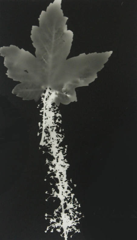
This picture was a first attempt at a star. When making this picture, was not sure how it would turn out, and placed the leaves randomly around the paper. After the print, I noticed that it looked like a shooting star. This was something I considered when making my next print. The leaf was also underexposed, so I should have made sure that it was longer than i exposed it for. I also should have left it in the developer for longer. It would have have made the image a lot cleaner.
Exposure time: 5.5 seconds |
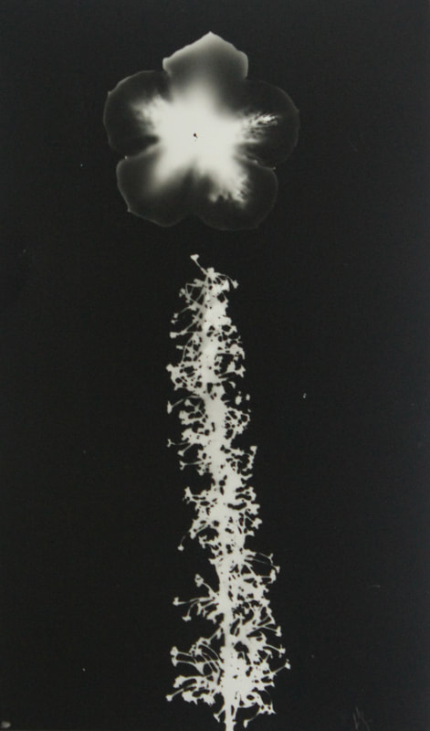
In both of these pictures I tried to emulate a shooting star. I used a violet plant and a flower to create this one. It required a lot of manipulation, but once it was developed, I could see it had turned out as i had excepted. This was the second attempt out of two. I was happiest with this one, as the flower I used luckily had 5 points, and came out well as a star.
Exposure time: 6 seconds |
Clear annotation of tasks, balancing description of ideas and technical processes. You are clearly thinking about your compositions but for some of these tasks- less is more.
ISO
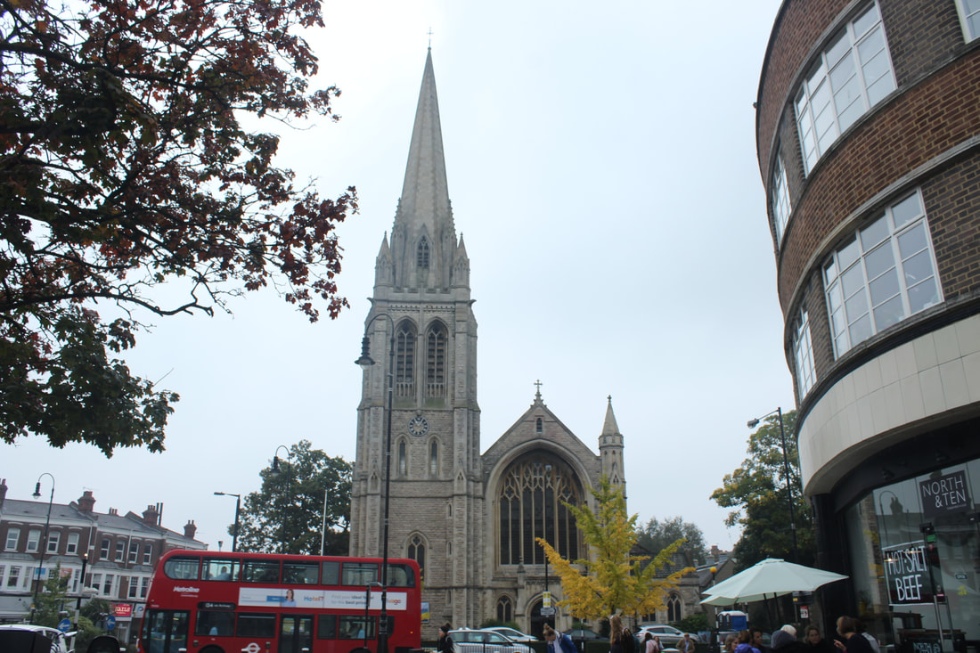
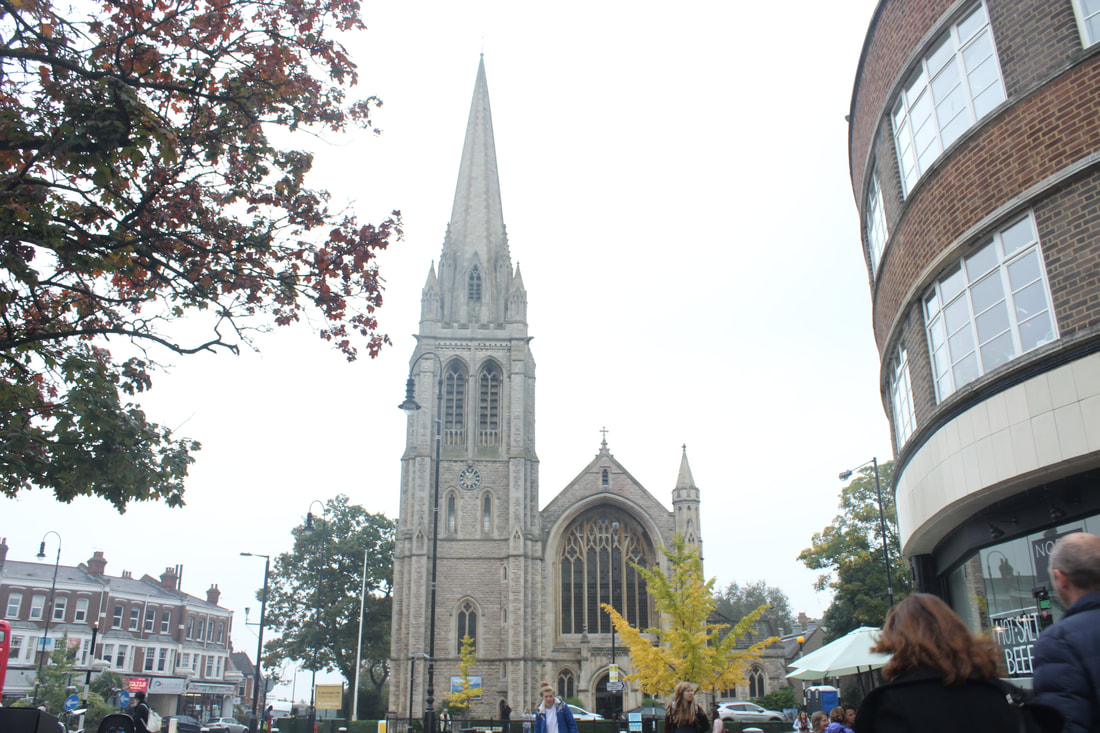
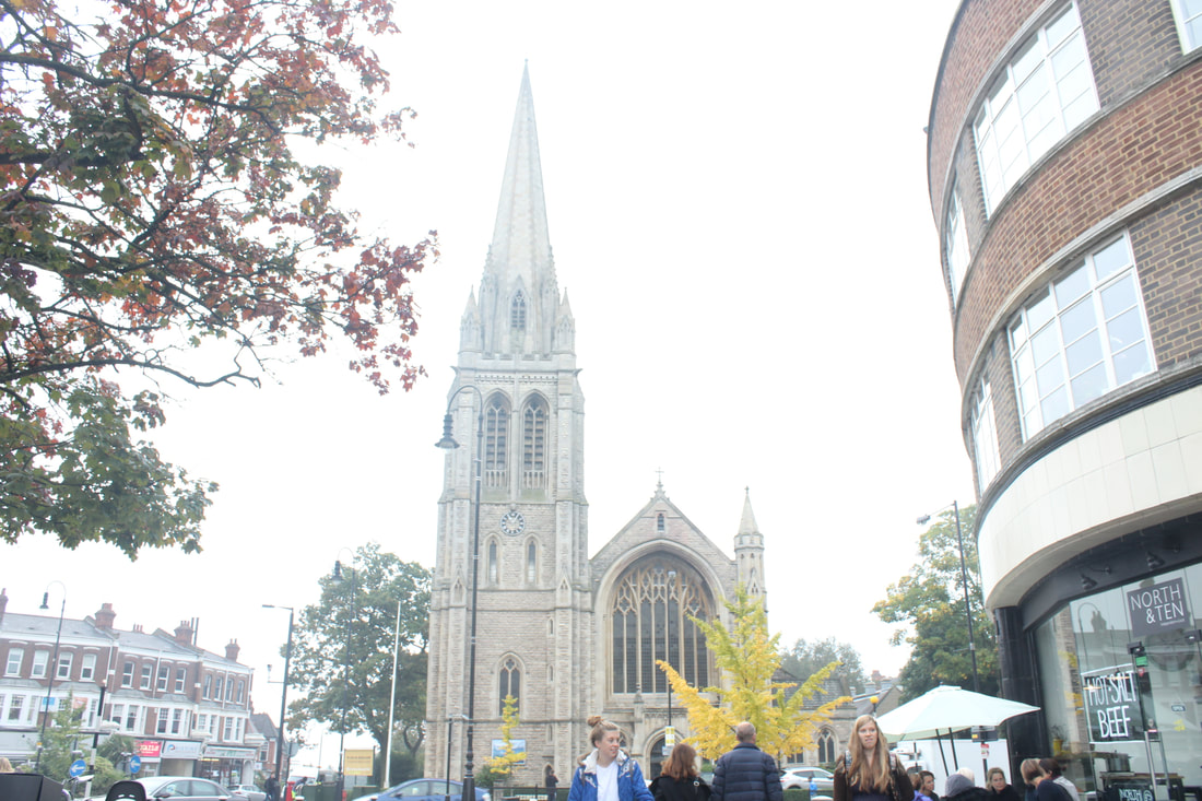
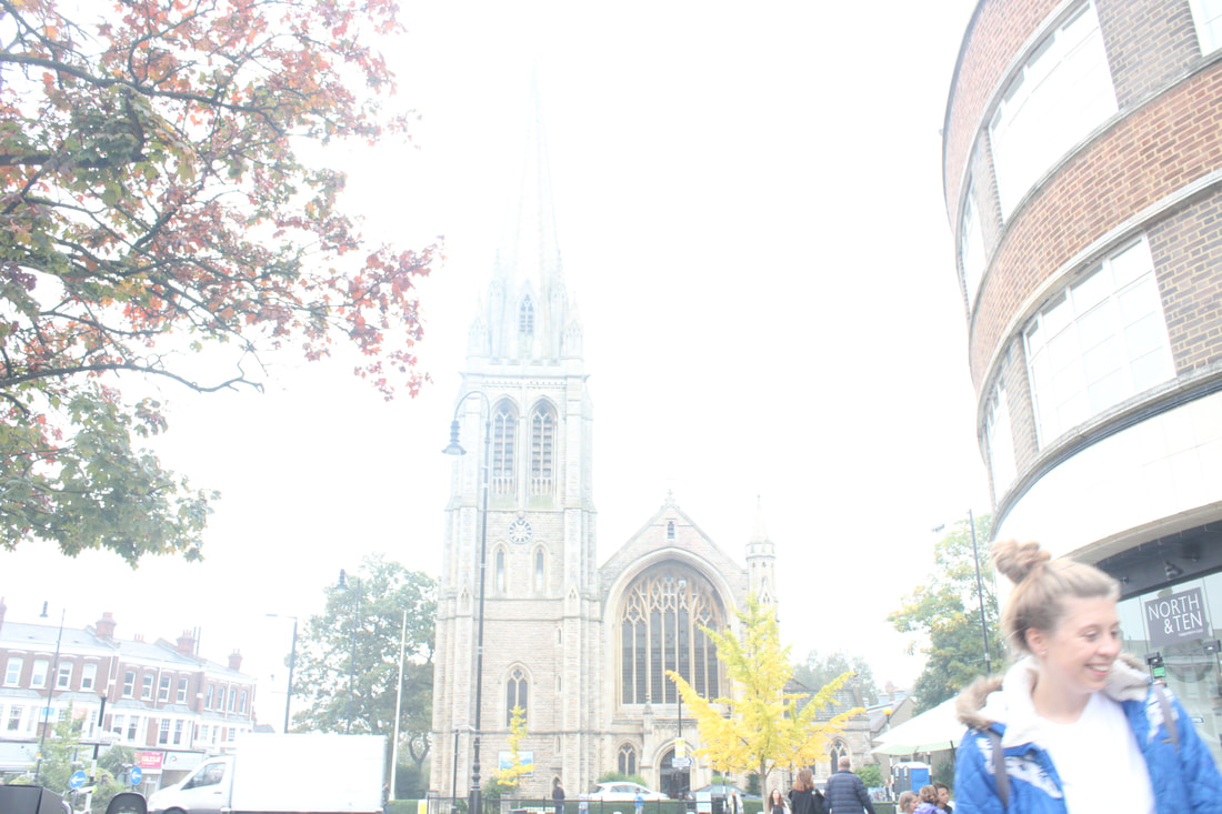
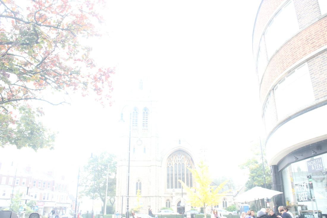
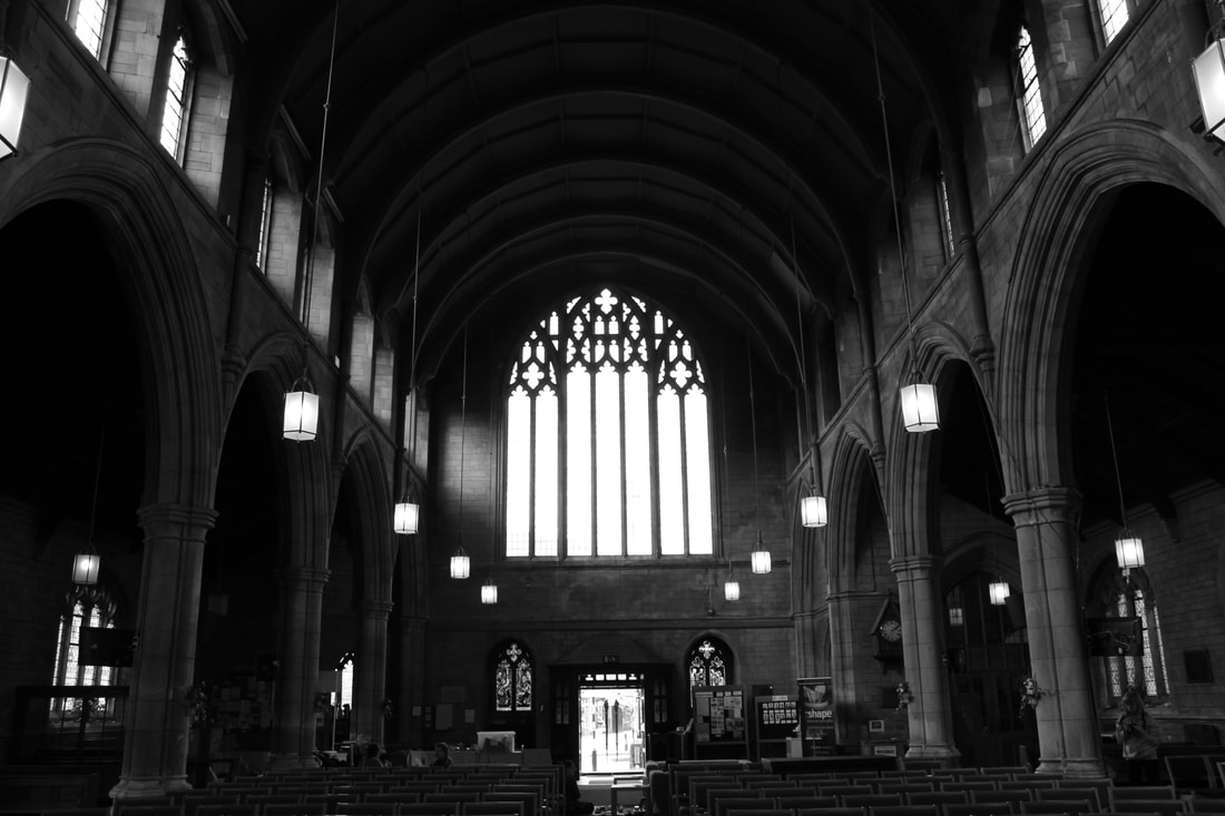
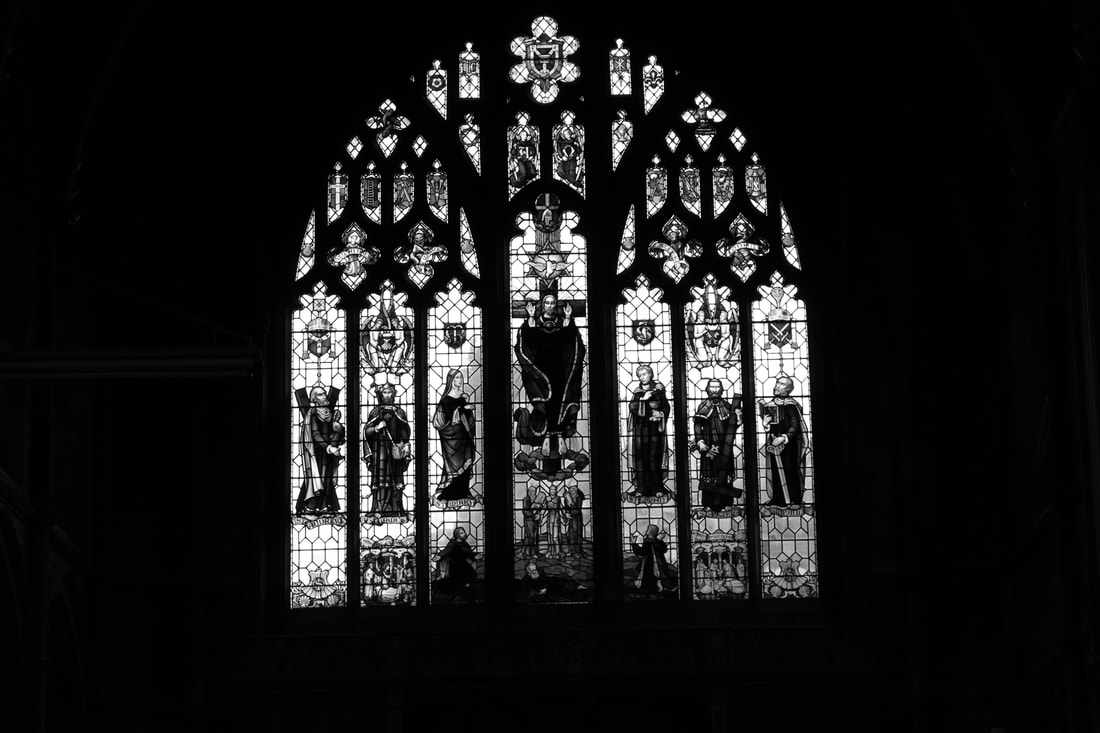
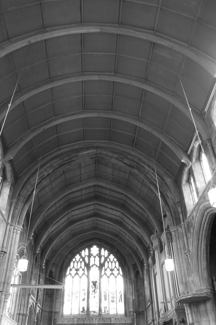
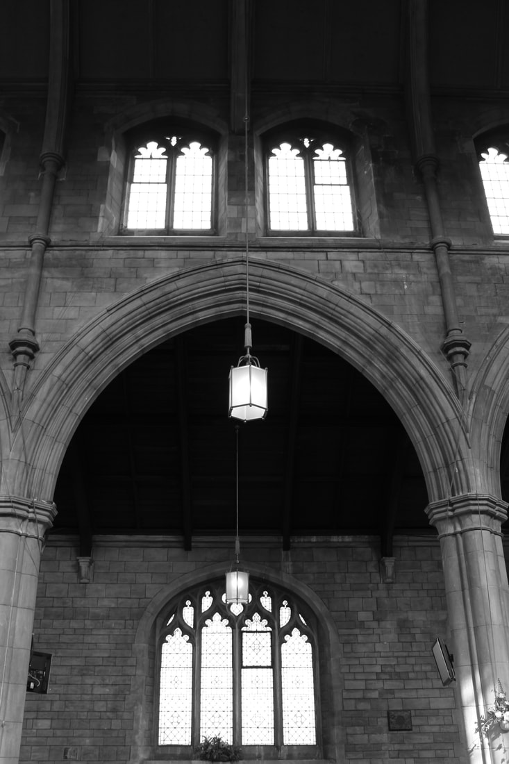
Underneath is the same picture of St James Church taken in exactly the same place, just different ISO numbers. The general result, is, as the ISO gets higher, the picture lets a lot more light in. This was because i was shooting facing the sun, instead of against it. If you click on the images, it will tell you the different settings that I used.
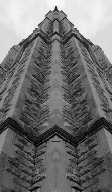
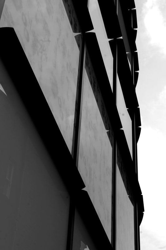
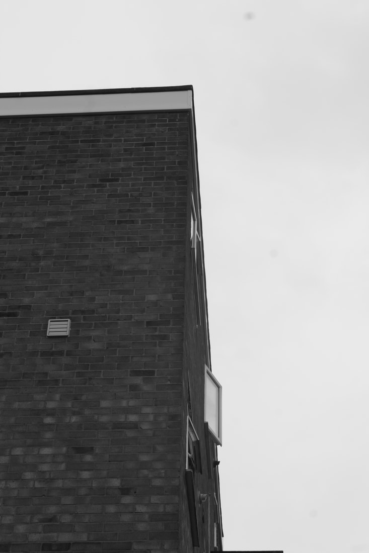
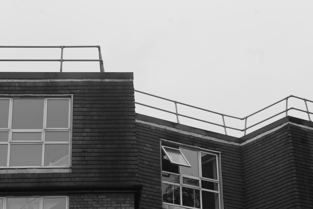
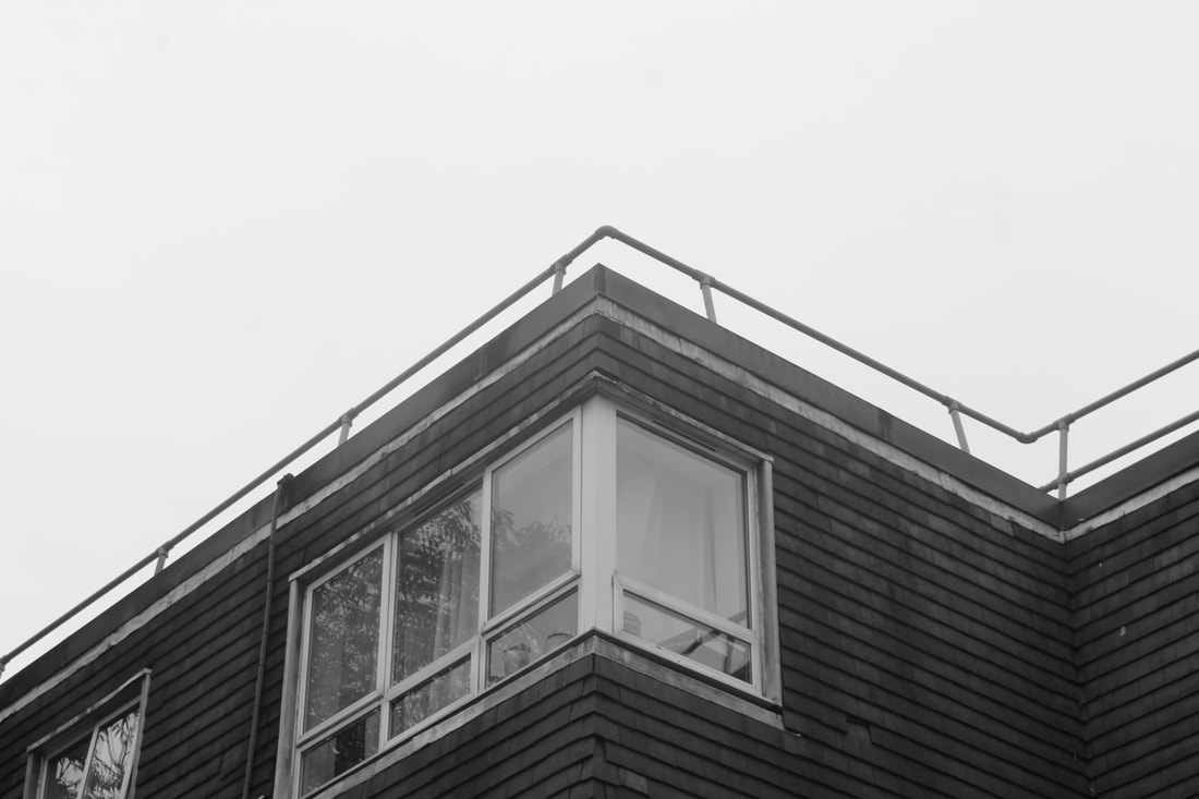
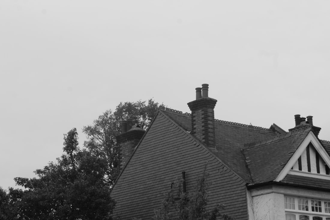
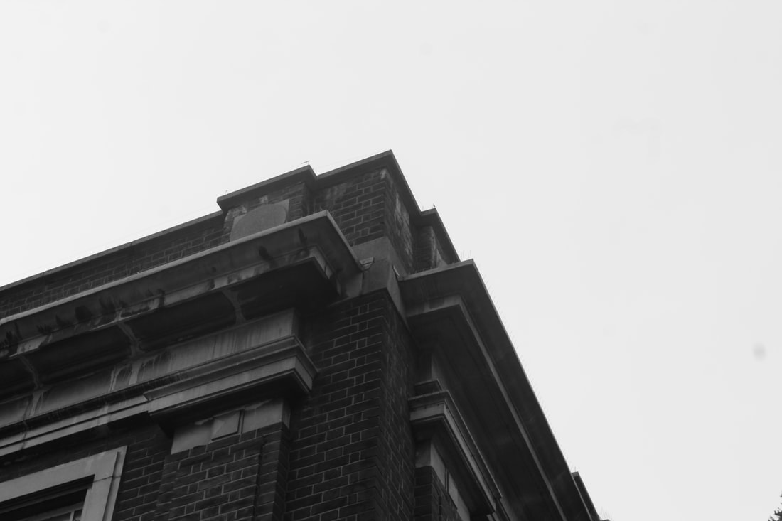
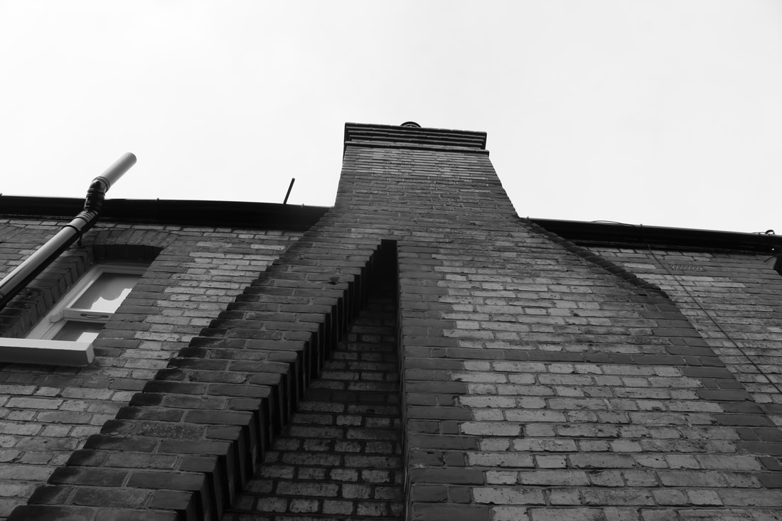
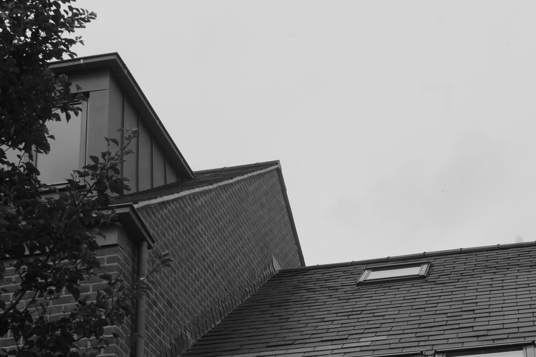
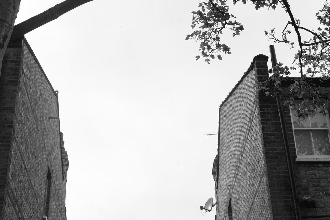
STRUCTURE IN ARCHITECTURE
I decided to take these photos in black and white, on the Creative Auto setting on my camera. I think that when you take the photo in colour, it is too distracting. When I took the photos in Black and white, it took the distractions out. It created a flat image, which means shadows stick out more, and the different create shades in the 3 dimensional photo.
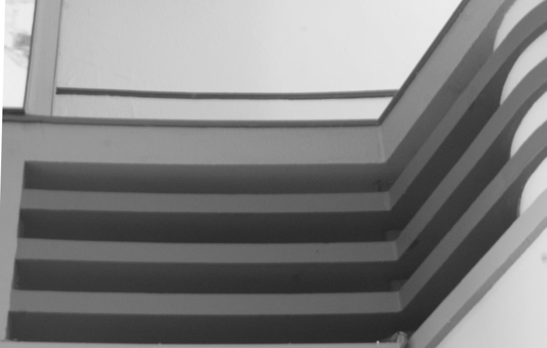
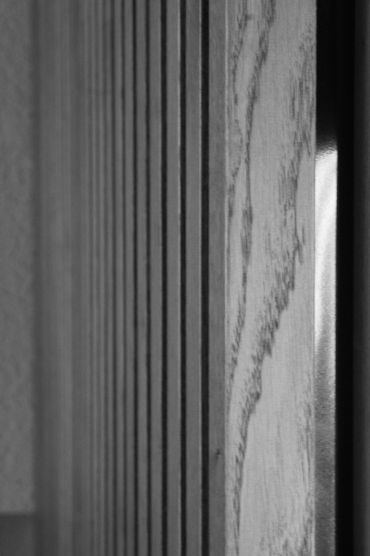
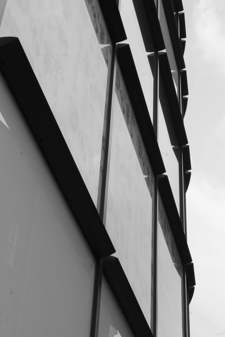
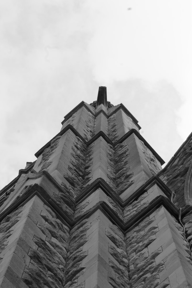
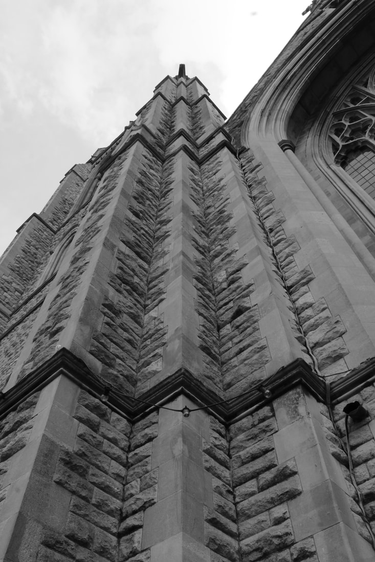
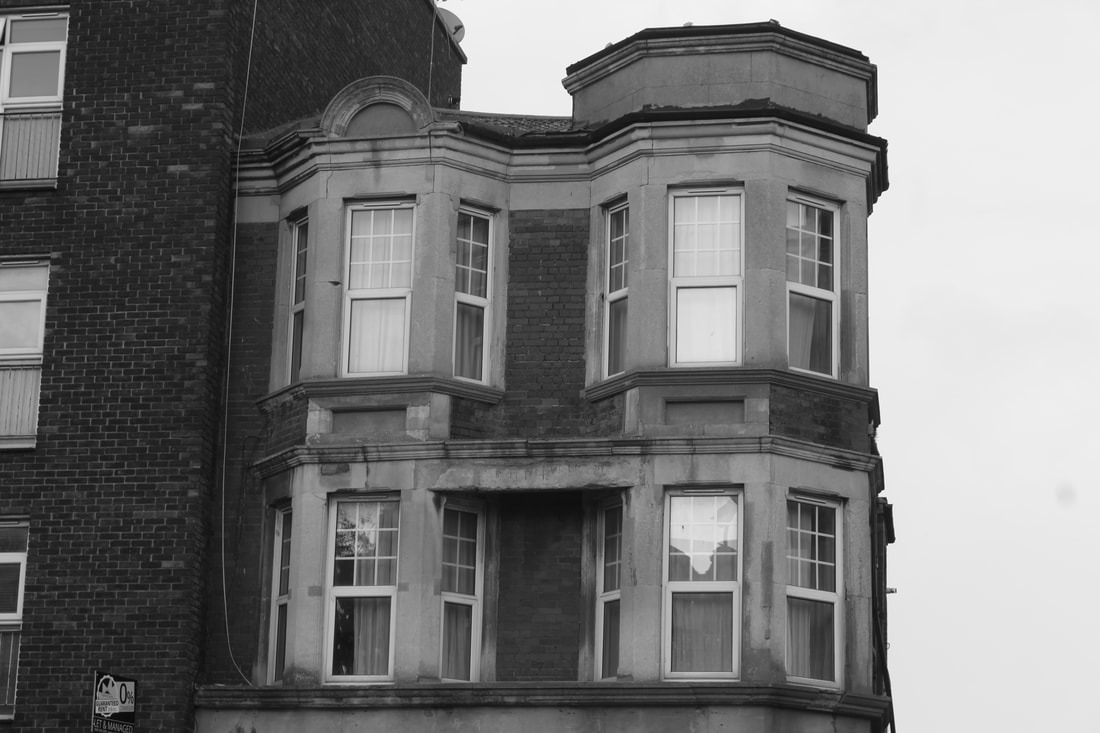
I always find that taking pictures facing upwards, or slightly tilted, make for a more interesting shot. In films, when the camera is slightly tilted, it can mean that something surreal or abnormal is going to happen. In this case, I think that it makes the picture seem 'other worldly'. As if it was about to fall into itself.
|
This was edited in post to make it reflected. I divided the picture down the middle, and copied, pasted and flipped it. This meant i had two identical half image. I then just slit them together, to make a reflected full image. I think this turned out much better, as the image before wasn't very interesting, or equal at all. In my opinion, i looks much better this way.
|
This was a photo of the corner of "Bill's Diner". It was taken facing up, to get the two different colours, almost a silhouette. It would have been completely black, had it not been for the windows They provided an underexposed shot of the sky. I think this is very interesting as it plays with the
different levels in the shot. First the building, then the sky, and then the reflected window sky. |
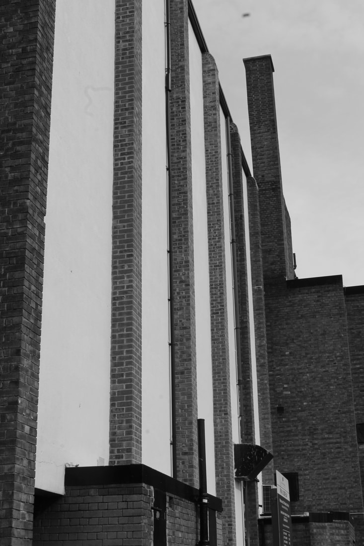
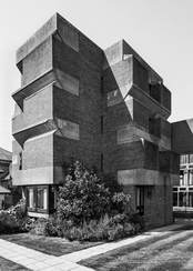
BRUTALIST STRUCTURE
Simon Phipps is a famous London based photographer that has taken many brutalist photos. He did a photos series "Finding Brutalism" where he took photos of Post War British Architecture.
|
|
|
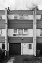
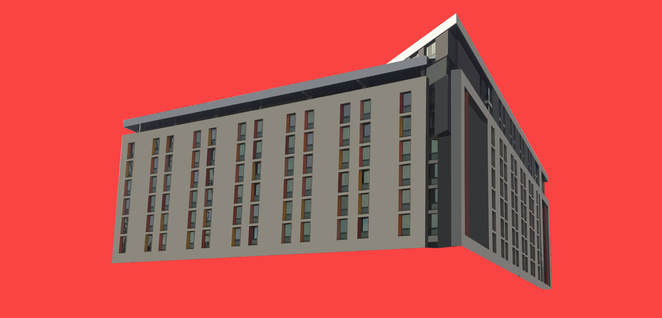
Here are some pictures I took around London to try and emulate the photographic styles of Simon Phipps. I took all of these pictures on the manual setting of my camera. This allowed me to change the Aperture, and then get as much of the background in the


SELECTS
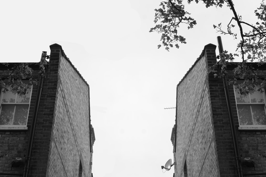
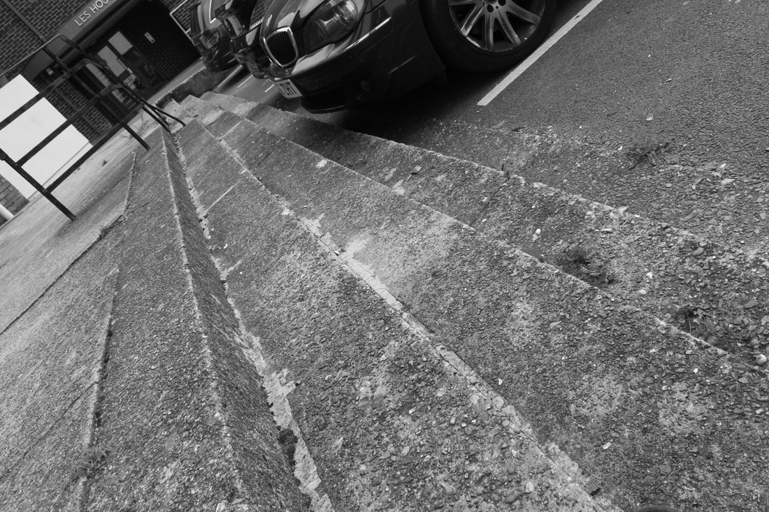
PERSPECTIVE - This was taken in an alleyway somewhere in Central London. It is taken from a low perspective, as I simply could not get to the correct height for the whole buildings to be straight on. I was able to fix the image with some skewing, but it made it very different, and I decided to change it back.
|

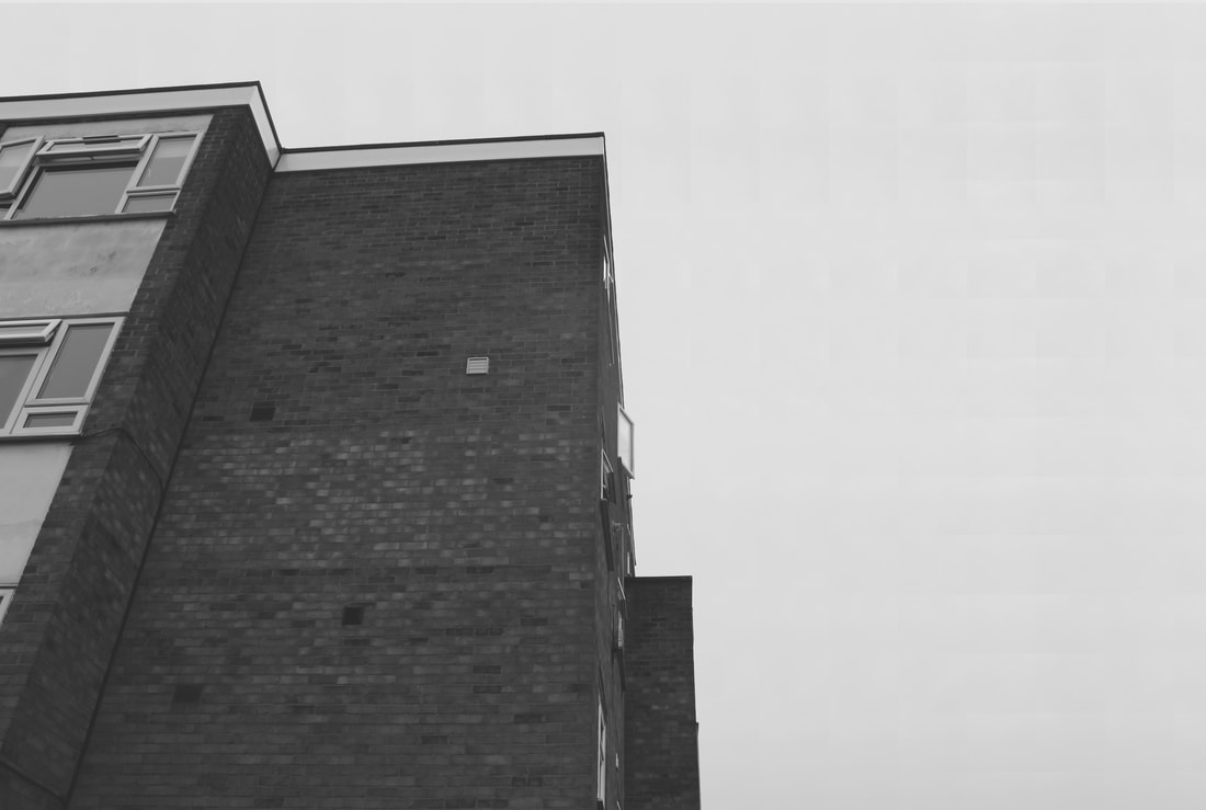
FORM & SHAPE -
This image was taken Somewhere in Muswell Hill. I caught the very edge of the building. I like how it had a reflection on the windows.The ridges of the building also compliment the brutalist concept of flat and harsh lines.
|
NEGATIVE SPACE - This image was taken on the corner of a street. It used a lot of negative space, as I wanted to take the corner of the building. I edited this image in photoshop, and changed the background. I tiled it both ways, and if you look close enough, you will see a very slight pattern.
|
BRUTALIST BUILDINGS
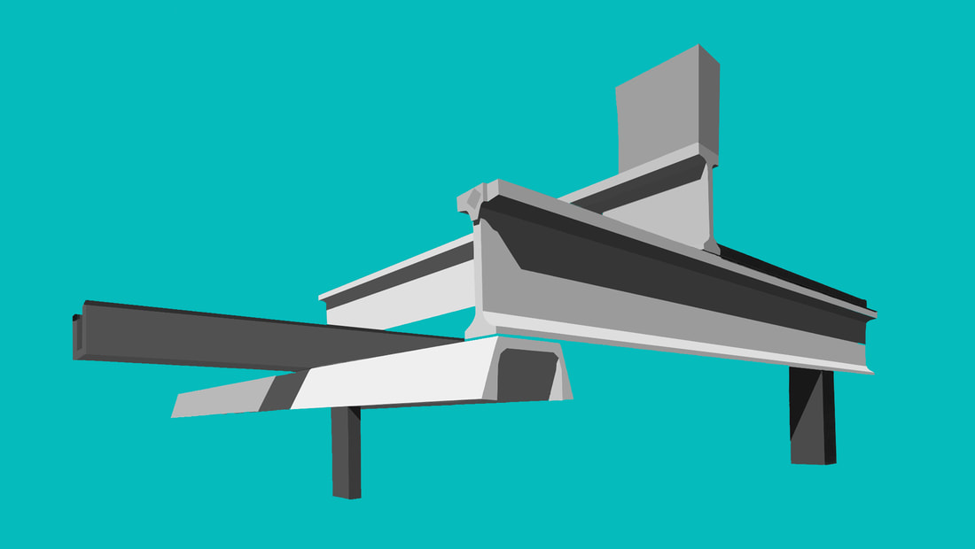
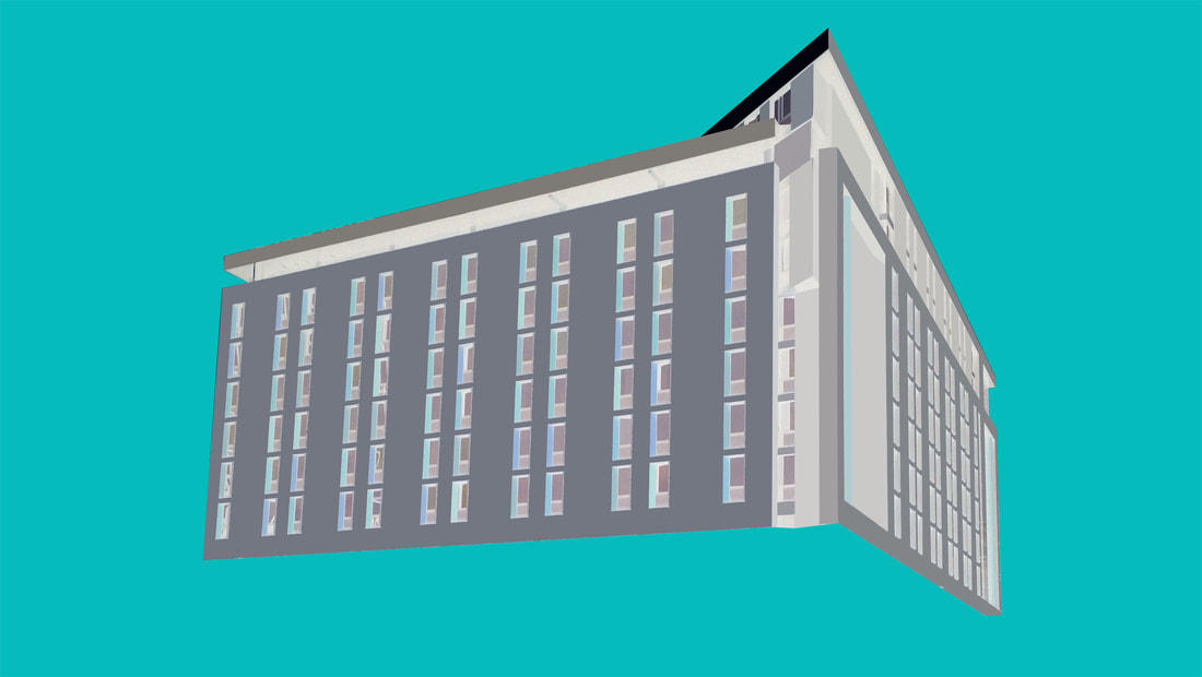
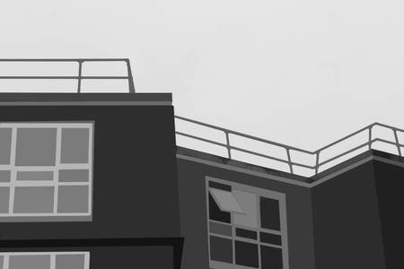
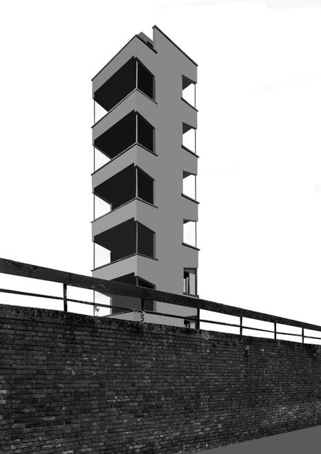
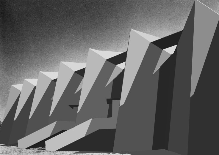
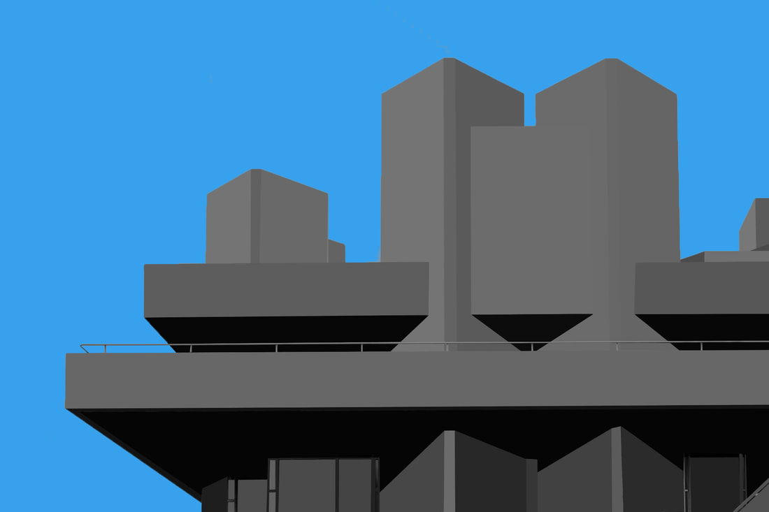
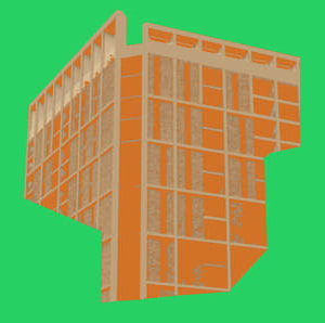
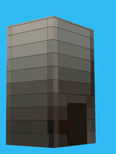
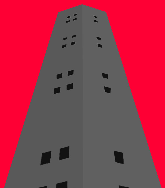
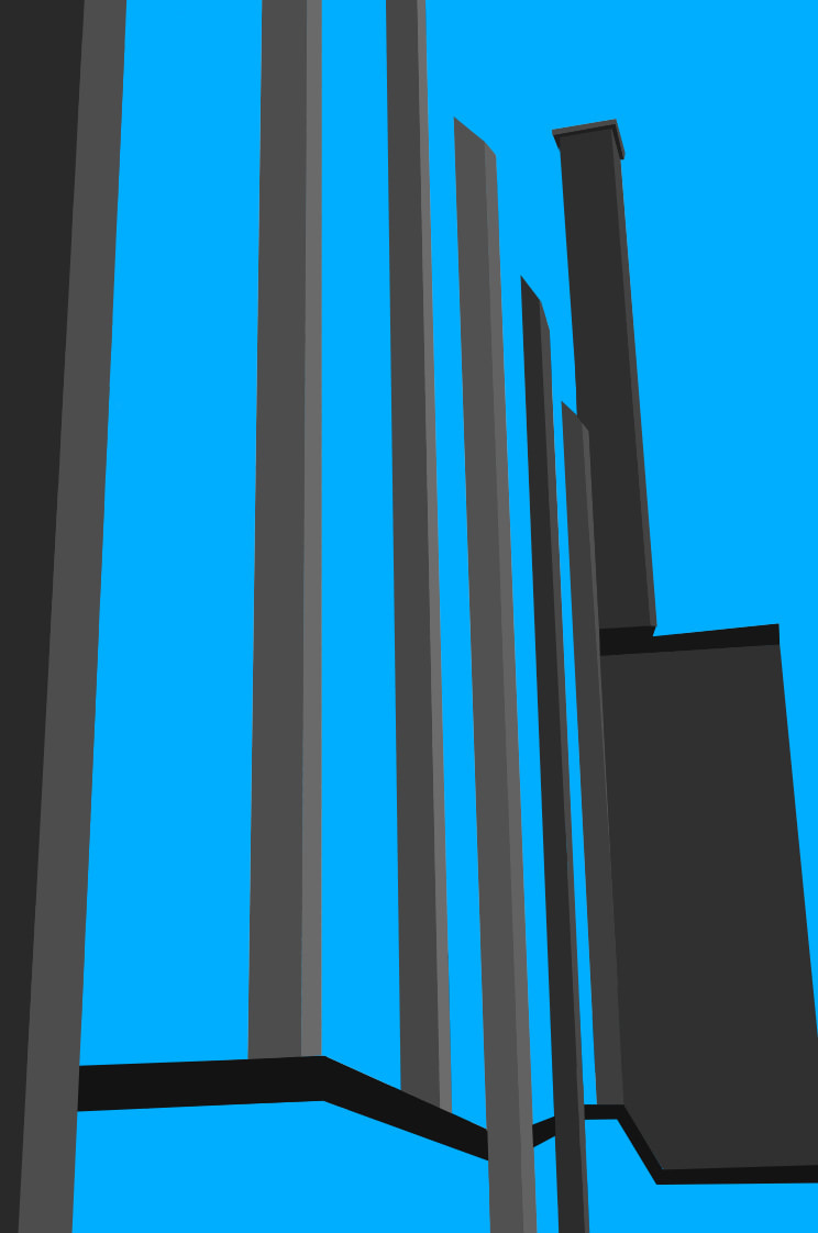
Brutalist photography is taking pictures of pos war architecture that has interesting geometric shapes, and straight edges. Brutalist buildings stand out from the landscape, and contrast the different tones. They are usually very dark, and flat colours, with the occasional brick pattern. Thomas Danthony is a pioneer of this type of photography. He goes all over the world taking photos of different brutalist landscapes. He then photoshops these colours and makes them all one colour, simplifying the picture, making it much more flat and tonal. The similarities of the colours contrast, and make the same colours stand out against the background. He use the same process, but takes a longer time, and is much more precise. By using the black colour as the shade, he can eliminate any of the things that he doesn't particularly need, such as people, trees and other things. This also allows him to take the photos whenever in the day he wants. He could be taking them at night, and then shade in, or he could be taking them in the day, and editing them to look like it is night. If i were going to use the amount of dark shading, I would set up a tripod, and take one in the day, and at night. This means that I could have the reference for shading, whilst on a brighter, canvas, which would be easier to see. He however, takes the photos at night. He is also known for making minimalist movie posters, which follow this pattern.
My Response
|
|
|
|
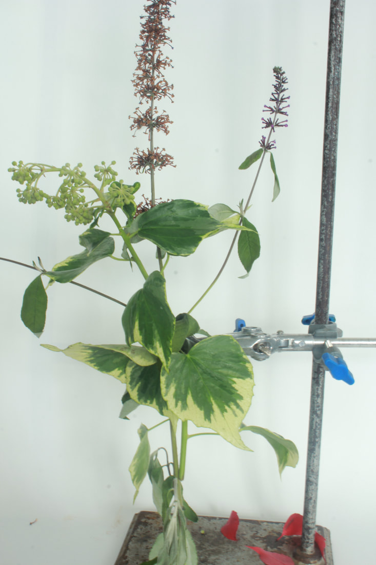
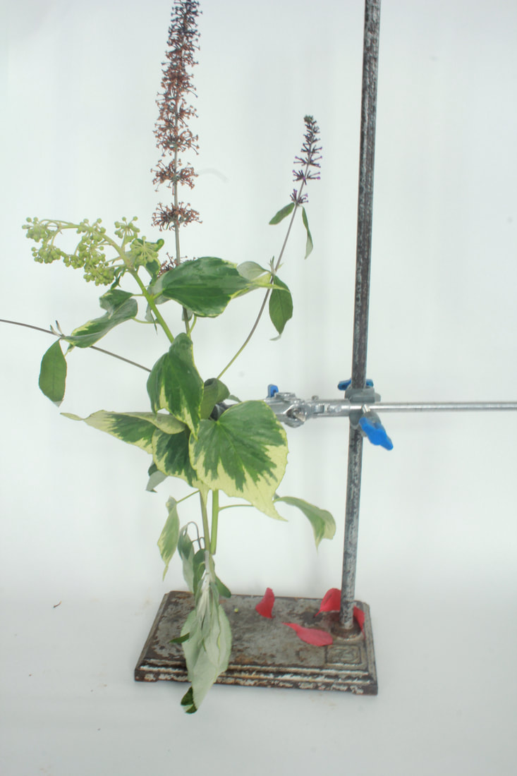
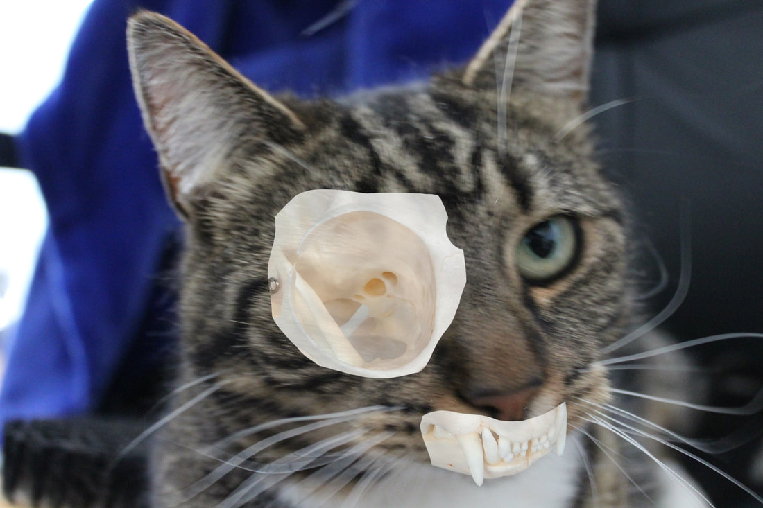
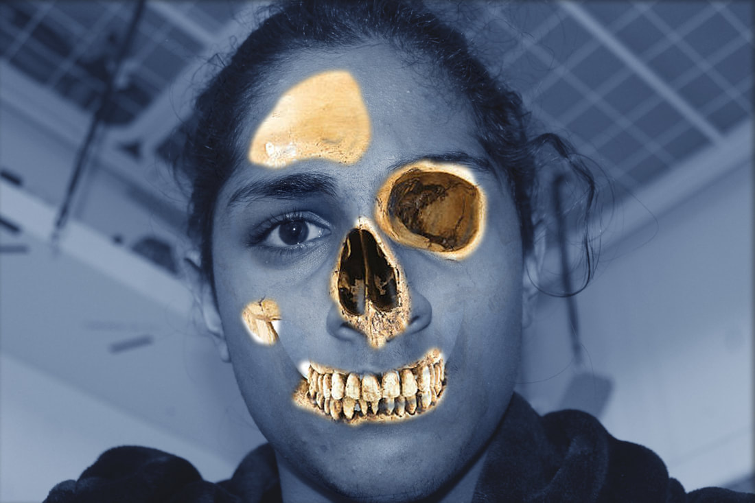
STRUCTURE OF THE BODY
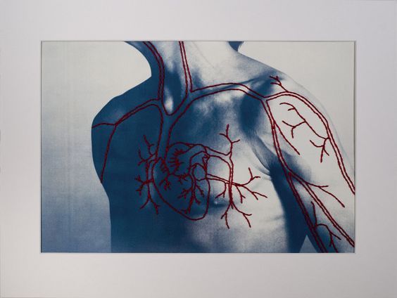
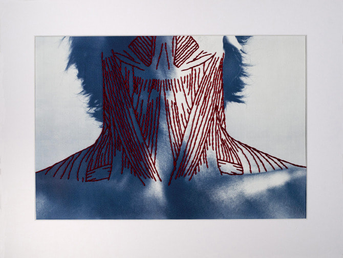
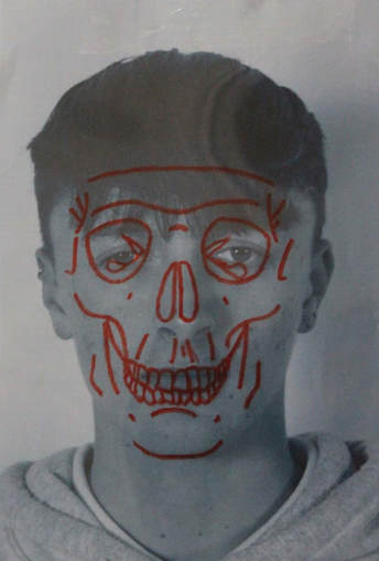
Peter Hickley is an artist that makes prints of people on watercolour paper with printed cyanotypes. He would the either sow, or stick string on to the top, to represent things, such as the muscle systems, or veins.
|
|
Here is my Response
|
|
3 STRANDS
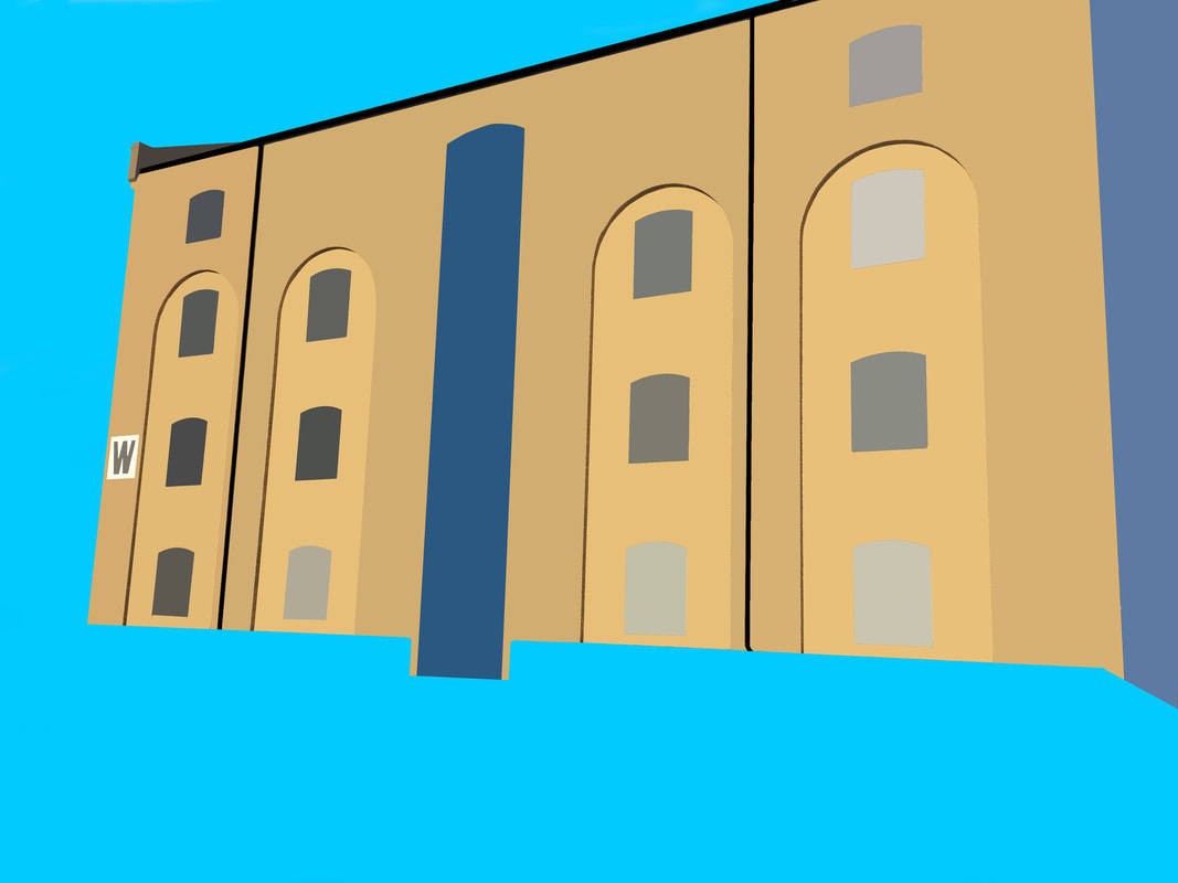
ARCHITECTURE - THOMAS DANTHONY
Thomas Danthony is a Photographer who mainly takes photos of brutalist buildings. He then uses photoshop to make the different faces of the buildings one plain colour. This gives the image a much more tonal and flat look, while making it also very interesting, and aesthetically pleasing to look at.
CONTACT SHEET??
|
|

Here are the before and afters:


www:
the colour- flattening the 3D into 2D
the green and orange one- colours contrast- they are the same tone creates an optical illusion
photographing from a corner
Curves- moving away from geometric shapes
ebi:
Isolate the buildings within the colour field
what's next
colour theory: research contrasting and harmonious pairs of colours.
THE BODY - PATRICK HICKLEY
|
|
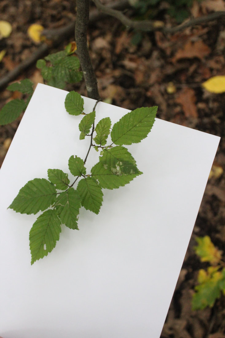
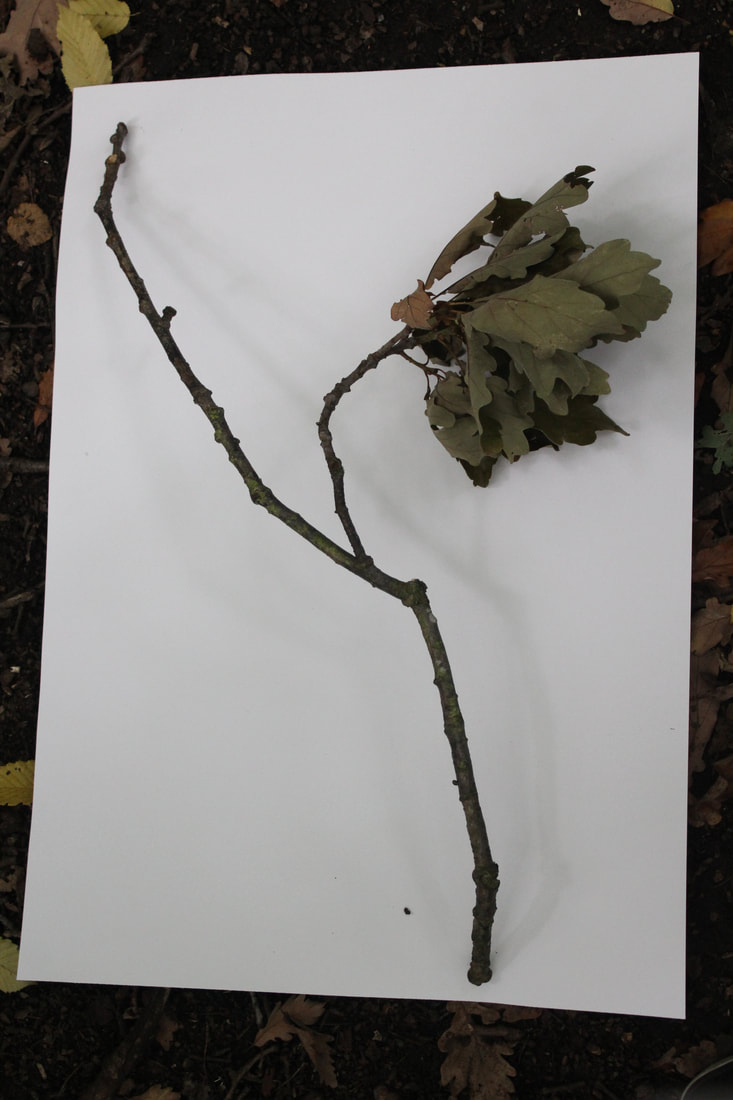
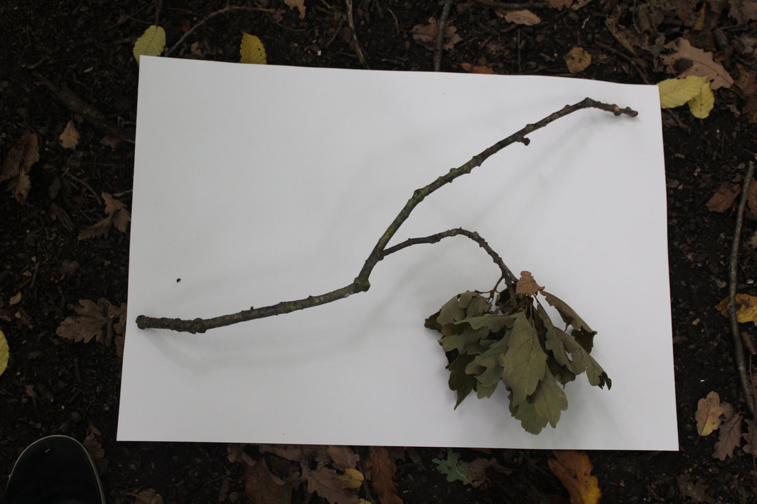
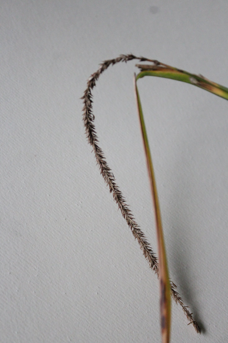
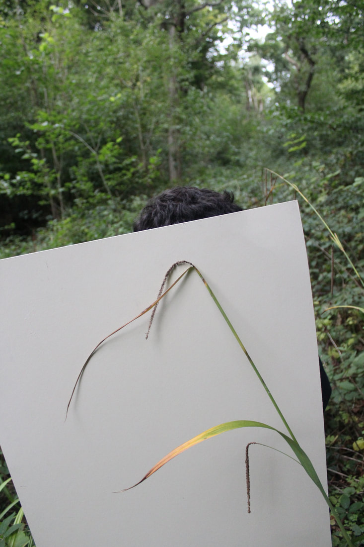
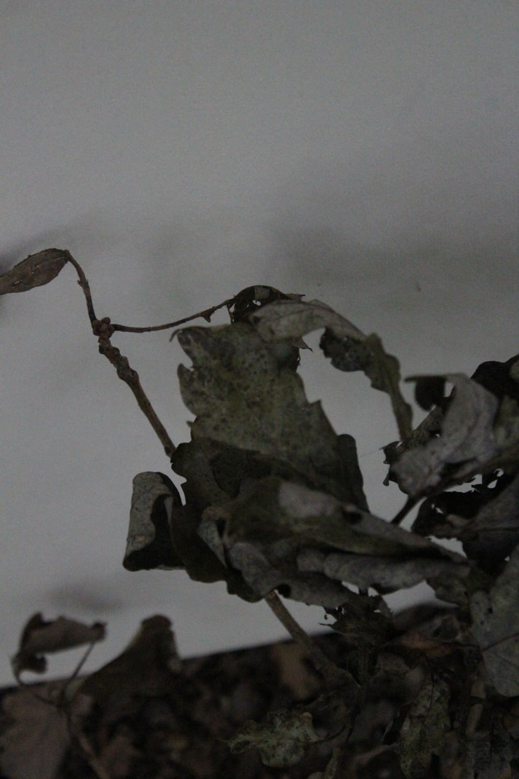
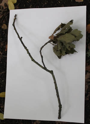
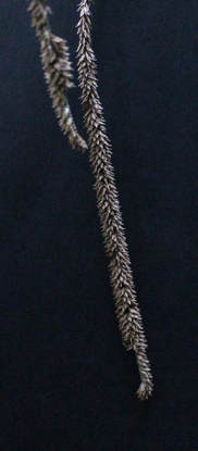
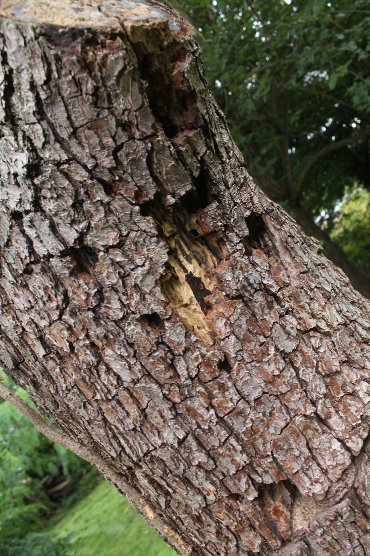
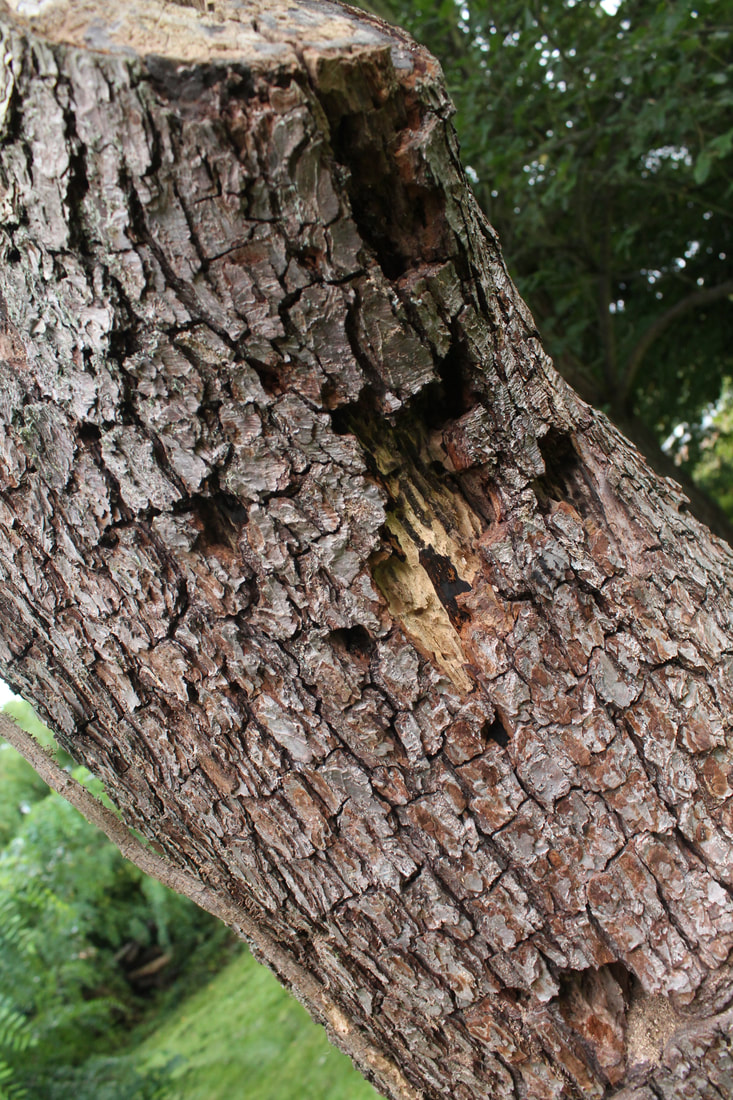
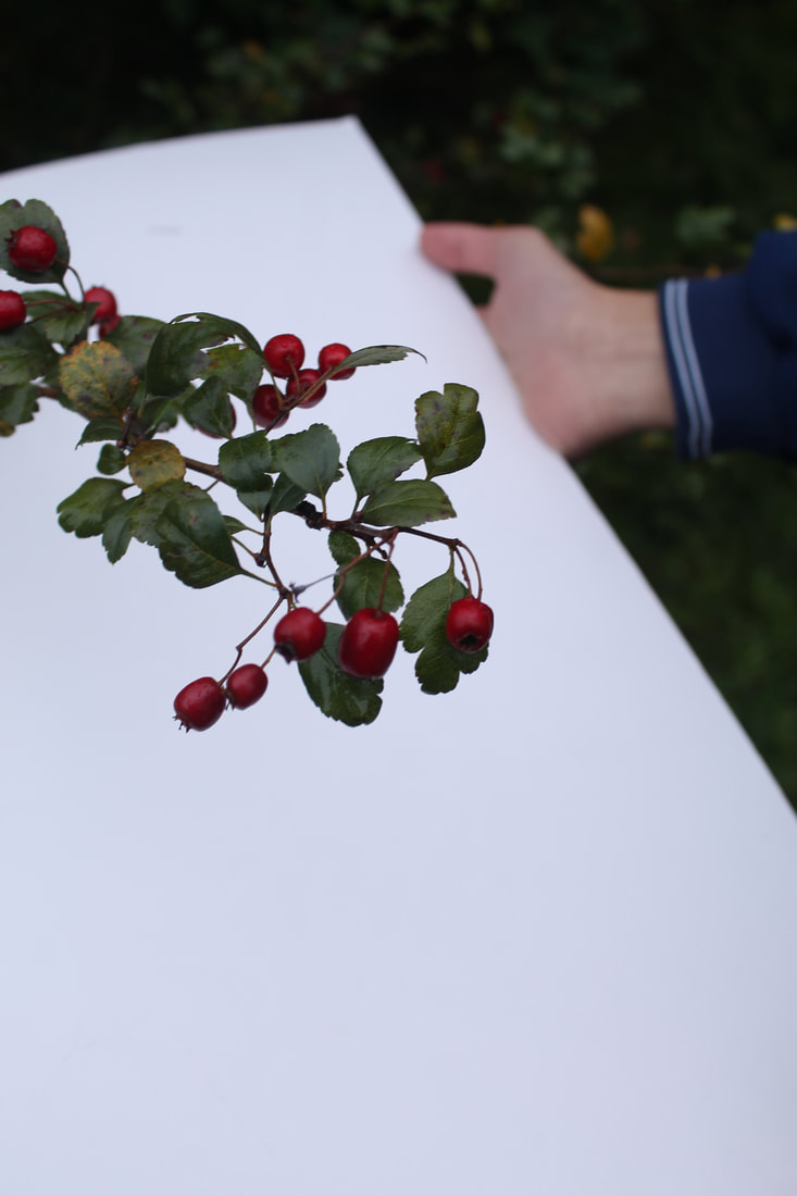
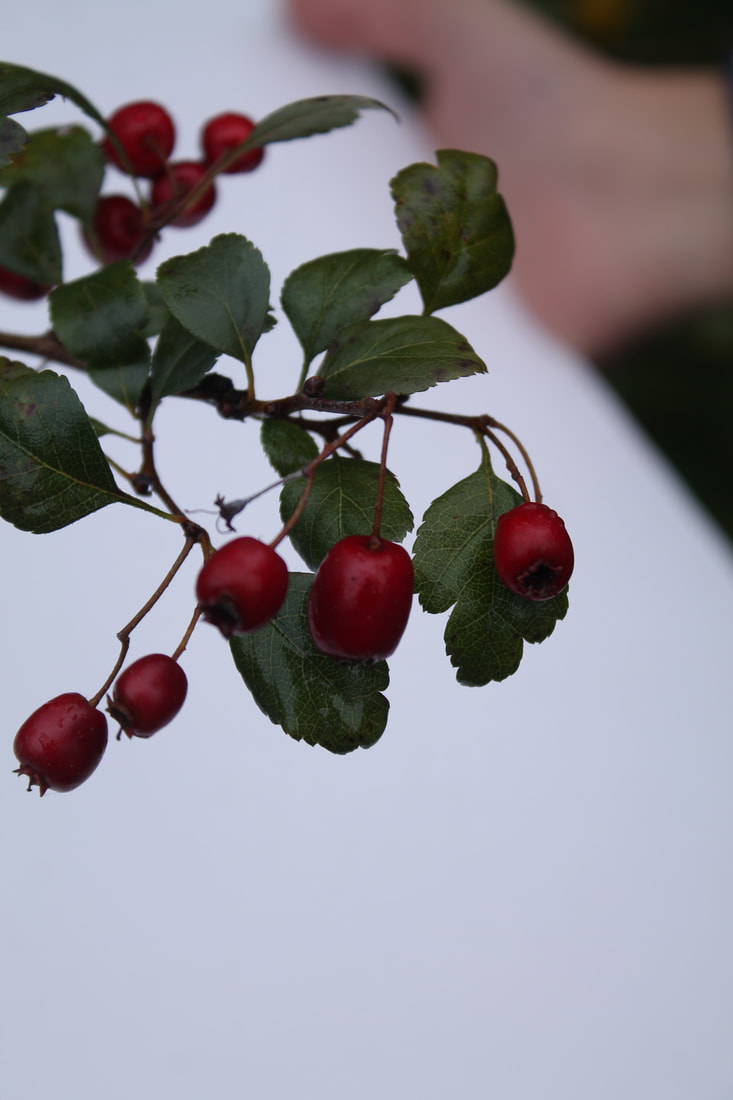
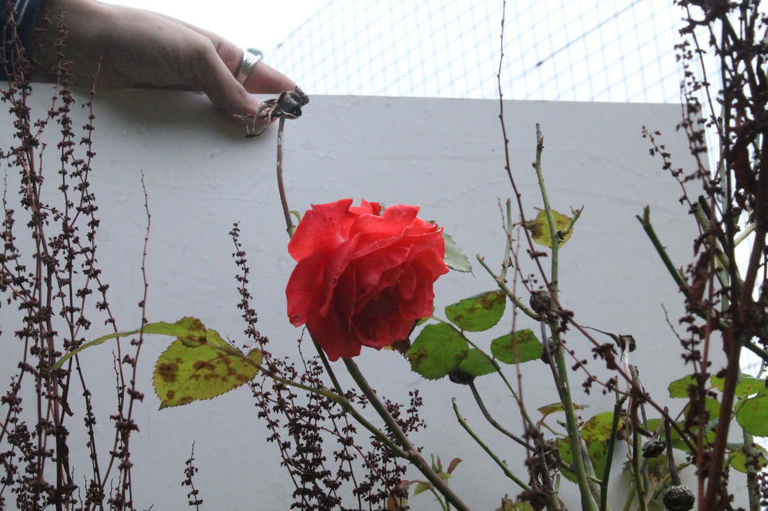
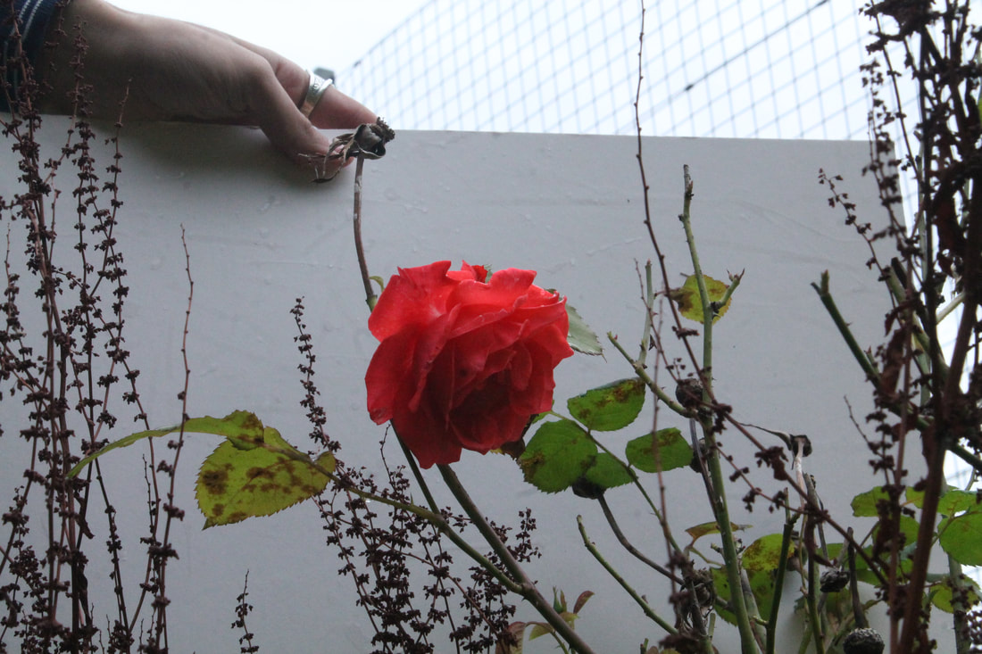
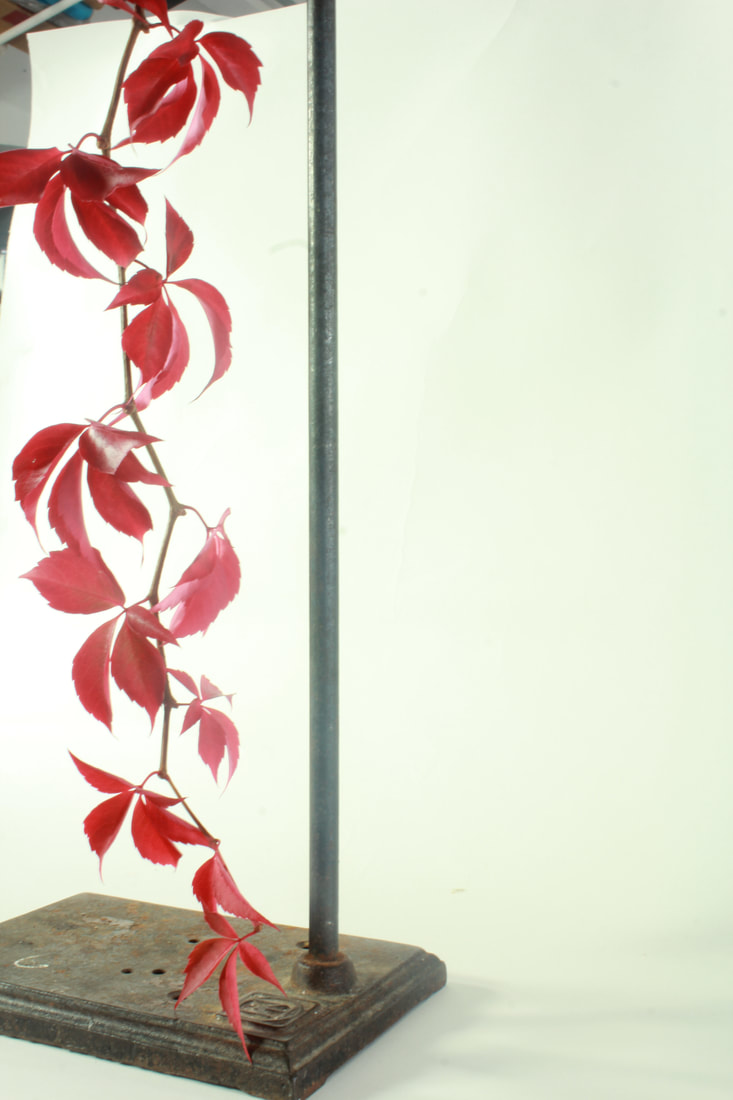
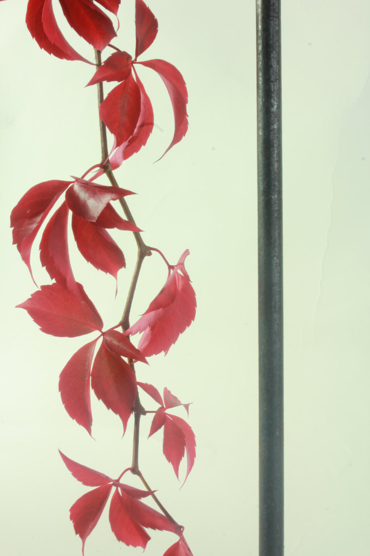
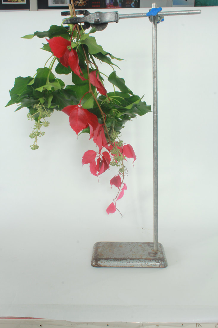
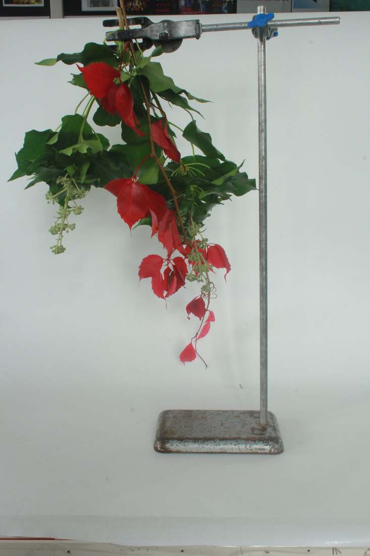
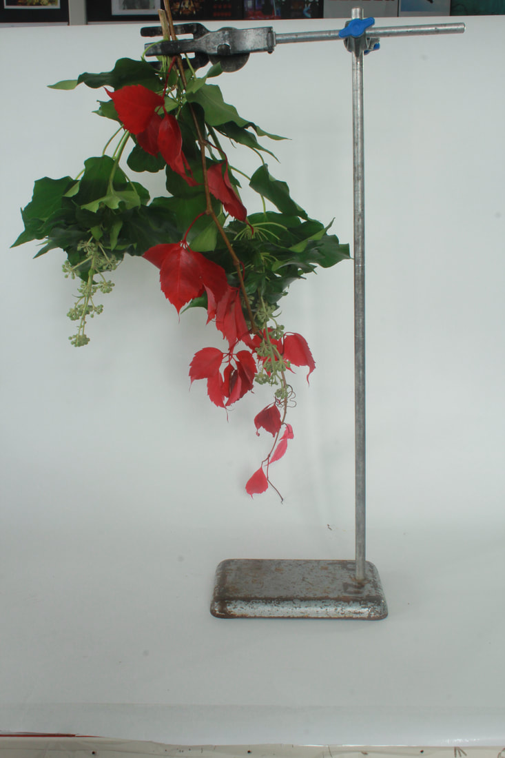
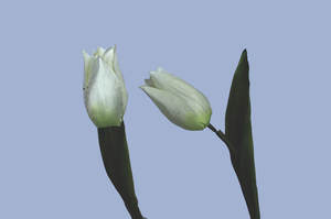
NATURE - MYOUNG HO LEE
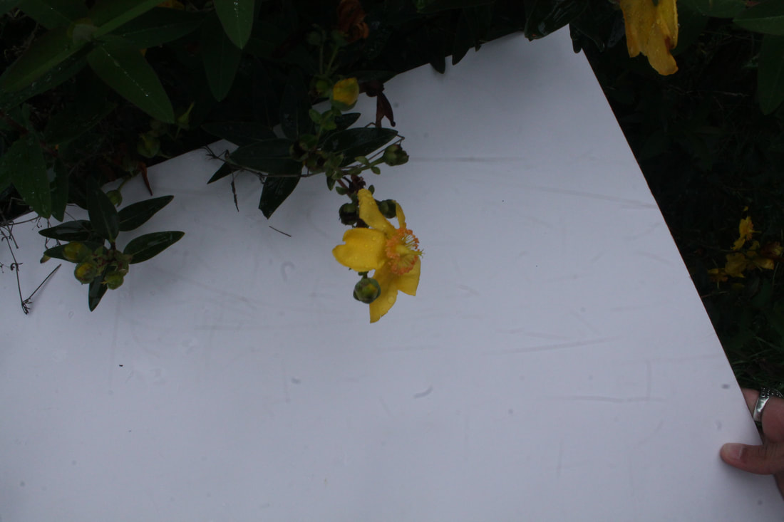
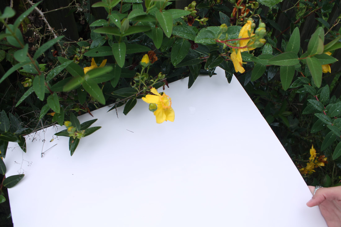
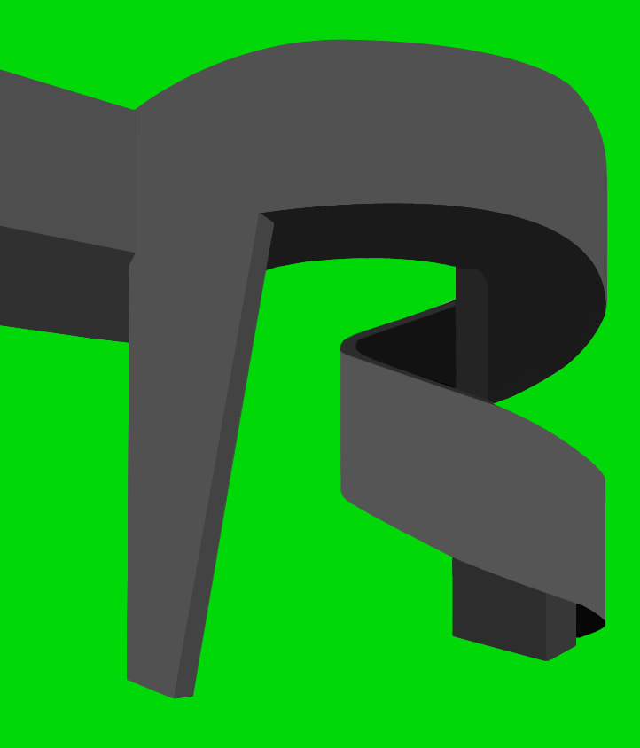
Myoung Ho Lee is a young South Korean artist who has produced a series of photos called 'Tree'. In this photo series he separated trees from their natural habitat. He only gets to take around 3-5 photos a year, as it takes a lot of people, heavy machinery and man hours in order to take it. They have to get the paper to be one monotone shade of white, which takes a lot of effort and lights. I decided to zoom in, and minimise the amount of shade. In some cases, as you can see underneath, they did not work. I average blurred the background, in hopes that this would help, but it unfortunately didn't help that much.
|
|
|
Colour Theory
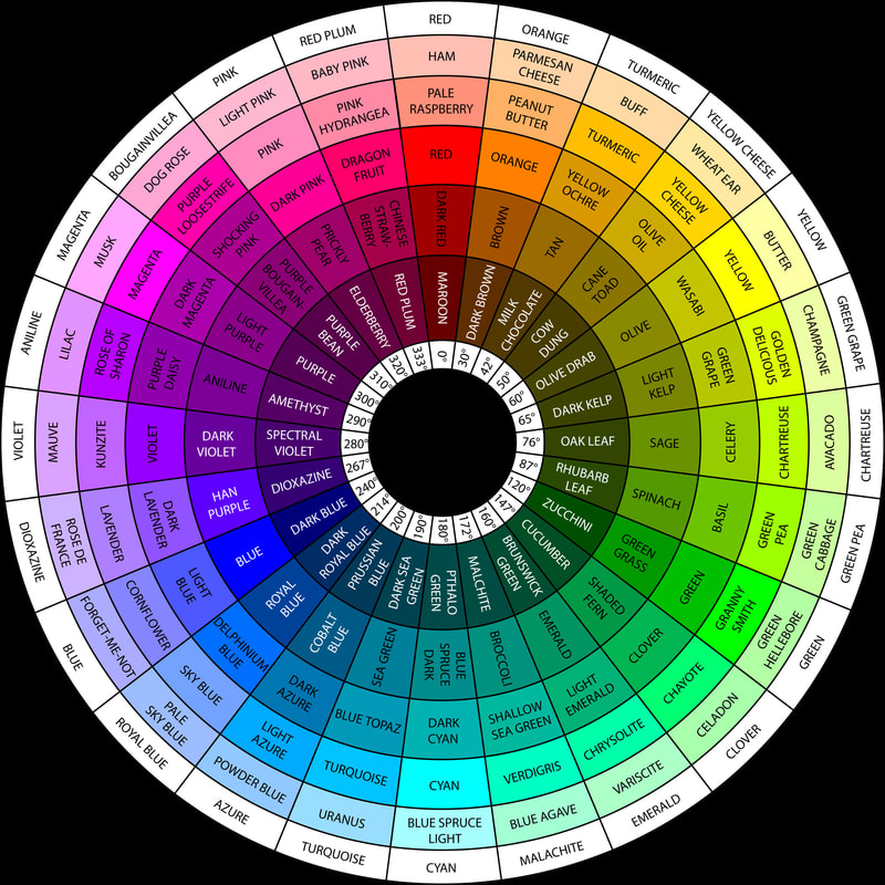
Colour Theory is something that will be very useful in my final development. Since I will be replacing the backgrounds, there will be a persistent need for a contrasting colour, to make the subject of the images stand out more. I am looking into simple types of colour theory, in order to change the backgrounds to better colours. one of the best hing to use, is the RGB colour wheel.
|
The RGB wheel stands for the Red-Green-Blue Wheel. It is showing that all colours are made out of red, blue and green. You can mix them, and it create almost any colour. It however, cannot create black. This is good though, as on my images the only black that will be used will be in shadows or windows. It will not be used as the background, as it will create a dark and eerie effect, that will certainly be unwanted. I would rather the buildings be in dark colours, and other colours in bright, vibrant and contrasting colours. This will allow for the buildings to visibly pop and jump out of the paper.
This specific wheel highlights the difference in colours oppositely, but also the specific shade of the colour that I have, and then that direct contrast as the background. For example, if i had a building that was 'Milk Chocolate', then I would have to mirror it with a background that is 'Prussian Blue'. This allows for a better result and bigger difference with the subject and the background. On Most of my photos, there is a background of 'Light Azure' or 'Turquoise". This means that the buildings had to be either dark red of brown colours. This is a brilliant way to differentiate the colours, and make sure the viewers of the photo feel happy subconsciously as well, as it is pleasing to see an opposite range of colours contrasting each other. |
FINAL DEVELOPMENT
I am using the Thomas Danthony Method of blurring the colours together. I feel that this creates a very tonal, flattened image, however, it also captures the very essence of sharp corners, and strict lines, which is very much the design that brutalist buildings like to take. For example, I have taken pictures of buildings with rounded edges, to make an interesting .
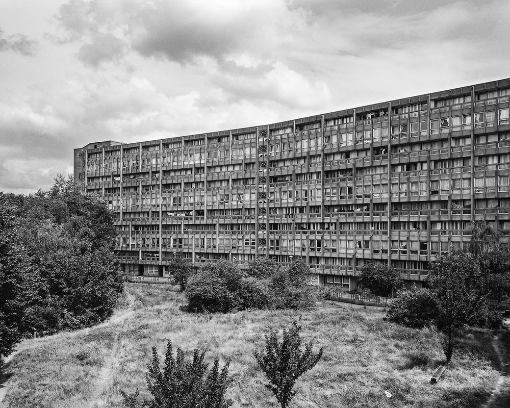
EROS HOUSE, BROWNHILL ROAD, SE6 4BD
WESTON RISE ESTATE, PENTONVILLE ROAD, N1 9EZ
|
|
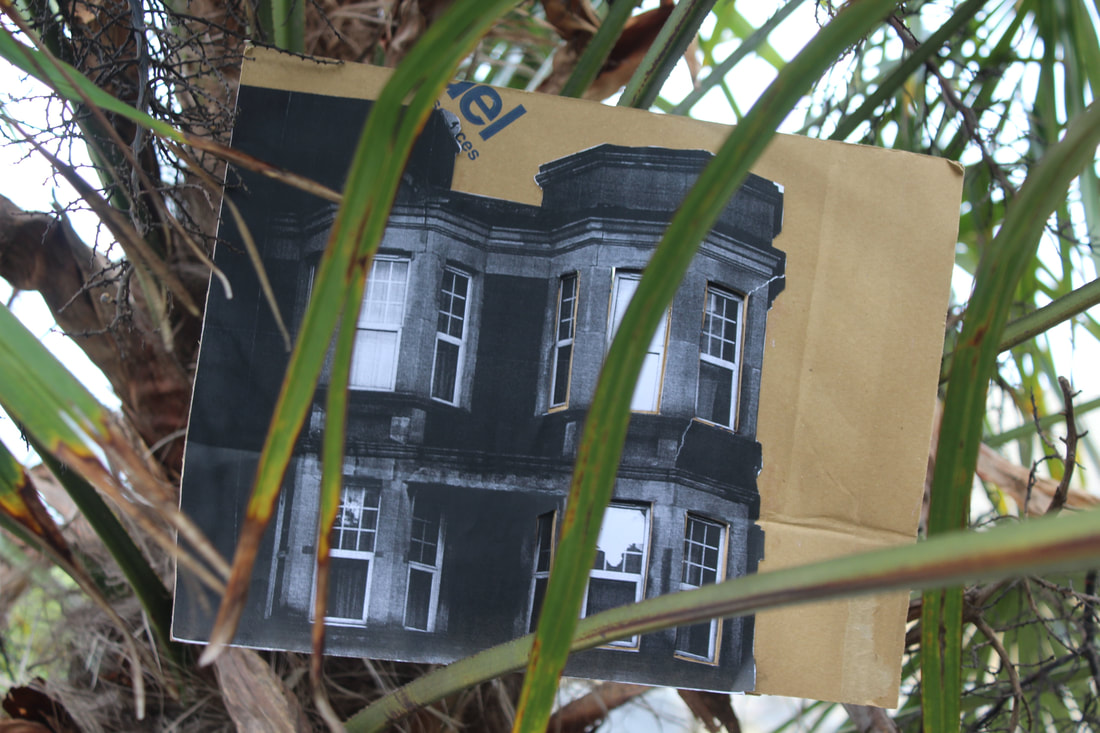
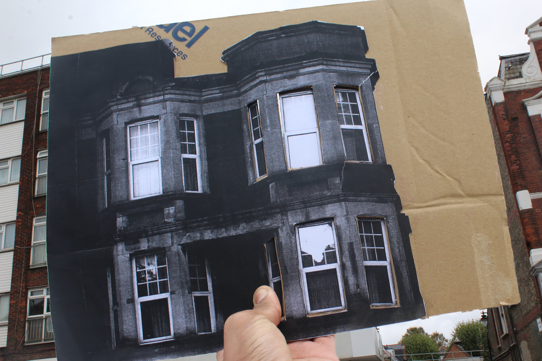
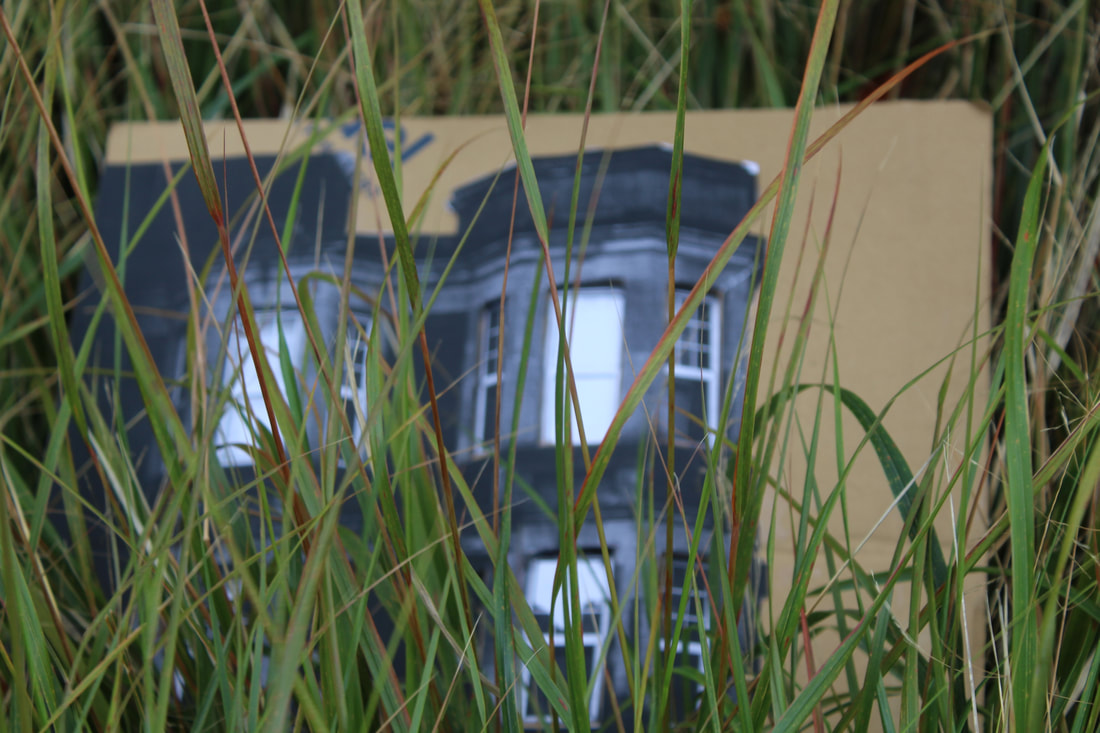
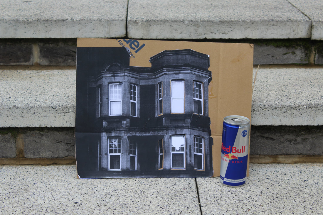
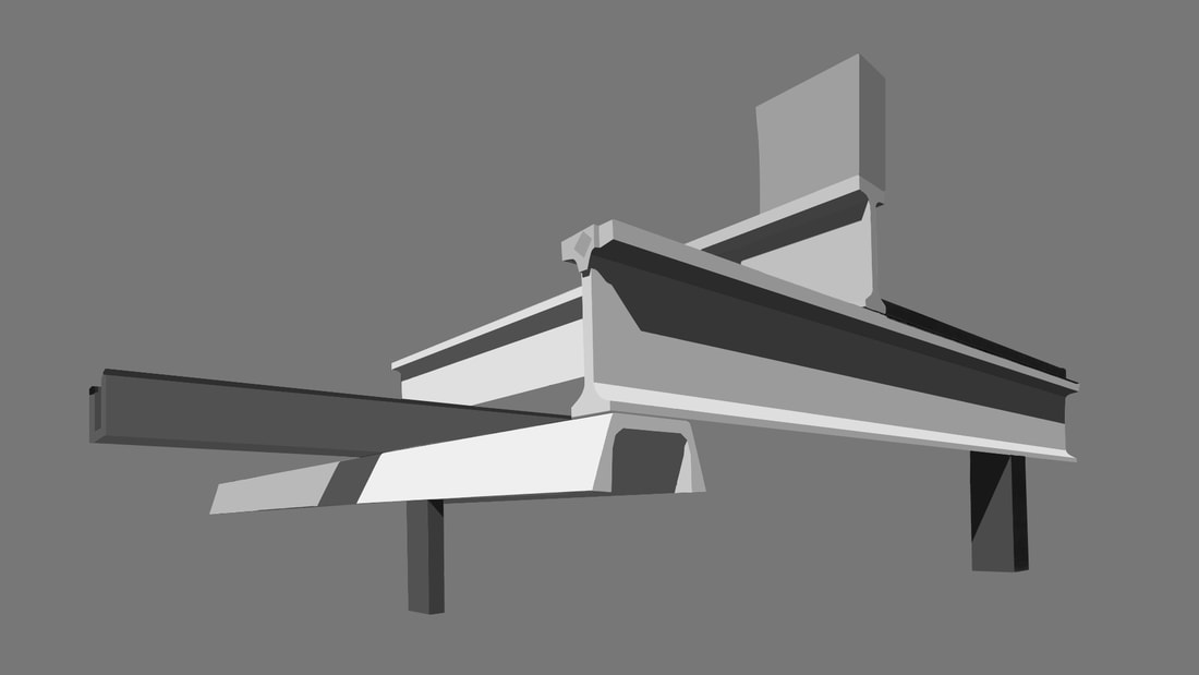
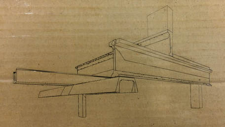
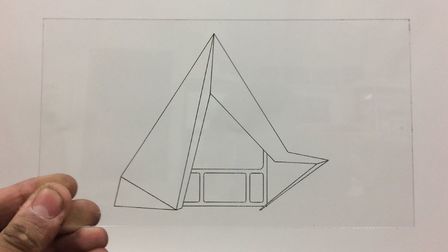
Experimentation: LASERCUTTING
I decided to use a laser cutting software to vectorise my images and then laser engrave them into a piece of cardboard. I will continue to try this with other things, such as acrylic, vinyl and more.
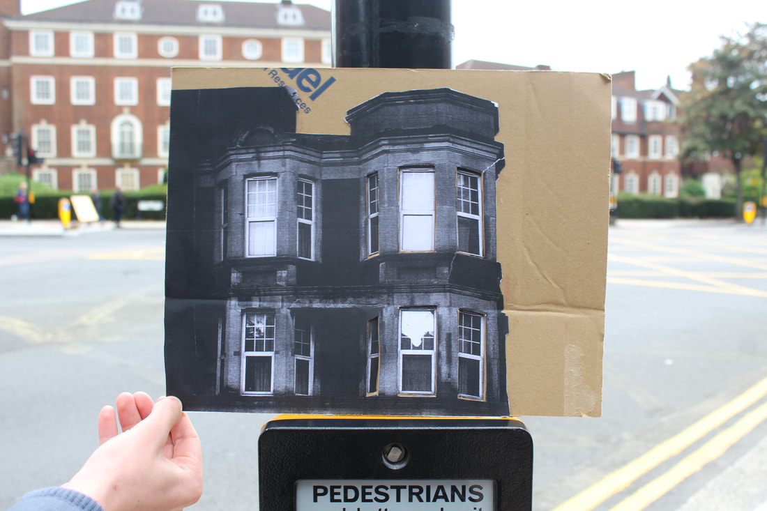
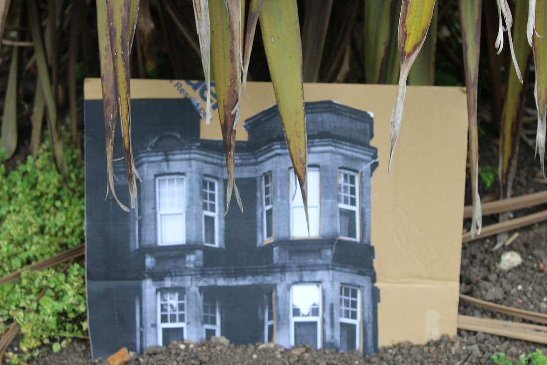
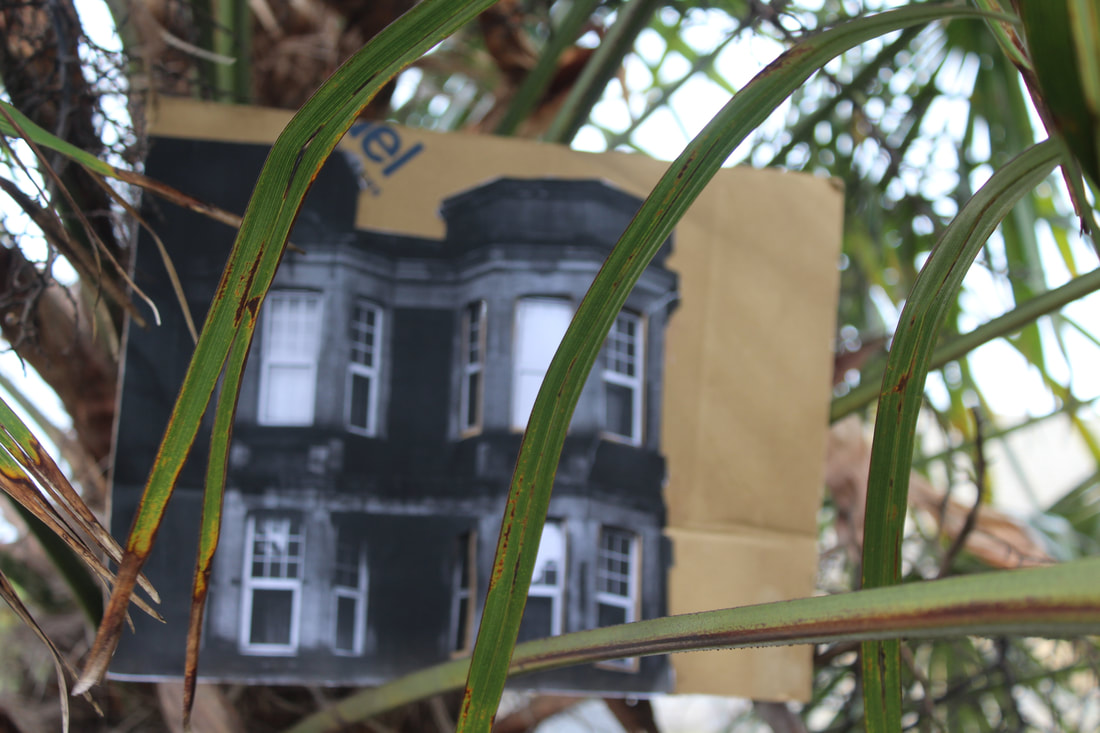
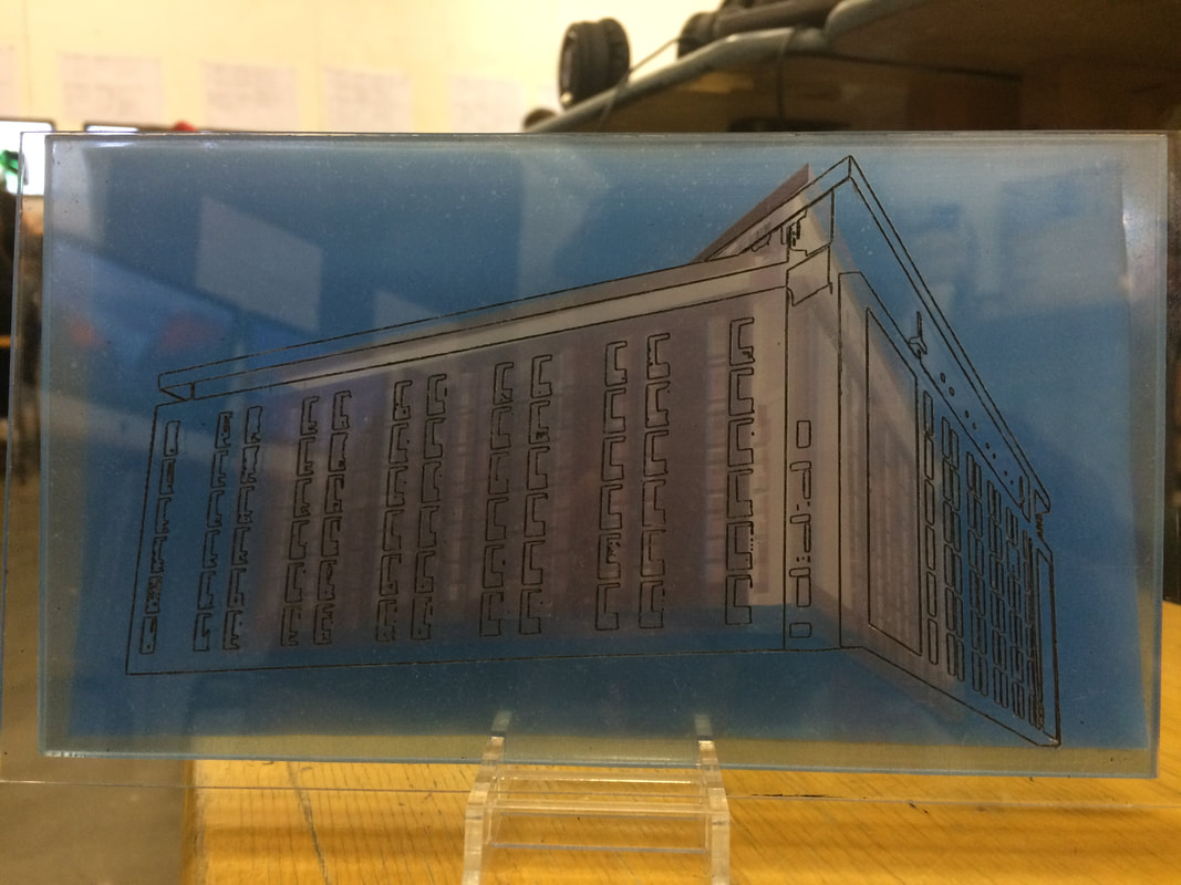
Here I vectorised an image that I had previously done the photoshop treatment to. I then sent this to the laser cutter, which cut the cardboard piece to 110mm by 195mm The black lines you can see in the picture below have been engraved into the cardboard. as you can see before and after, the image ,when vectorised, left a few random lines on the actual cardboard. It cut odd circles and marks. I feel however, that this gives the image texture and brings more to the 3d perspective of it. This could possible be due to the resolution of the image, and the size. I think that for the size to fit without marks, it would have to be much bigger, and would not fit in the laser cutter.
I think that this result turned out not bad overall, and the cardboard engraved great, as the lines were burned in and almost through, giving the picture some depth . When I try it on acrylic, I will have to engrave it and cut the square the same size. I will have to then paint the top of the acrylic with paint and then black wash it, causing the lines to show out in a black boldness.
^JPEG^

^JPEG^

^JPEG^
|
^CARDBOARD^
^ACRYLIC^
^VINYL^
|
I will present these findings on a piece of MDF. They will be mounted on the board, and will be matched up with the corresponding physical representations. I will print out the pictures, and place these on the left. Underneath, I will label where the picture was taken. The different pictures will be matched up with small office pins, and a small rope. I will mount the physical designs (acrylic and cardboard) on the board, and get them to line up with a edge. The labels for the places will made with an embosser.
CHANGE OF PLAN
I have designed a jig that will hold all of the physical pieces that will be cut out of ACRYLIC. It will be used as a light-box. This will allow for them to overlap. This jig will also be cut out of acrylic. I will still cut out the vinyl pieces, just to fit together with the cardboard.
The pictures will be printed on acetate, and will be presented as well. They may be layered in front of the pictures, or behind. If so, I will attach them with clear scotch tape. This will make for a very interesting effect, and when light is shone into it, it will create a very interesting surreal effect.It will also allow the user to see either the acrylic r the picture printed on acetate individually. Since some of the small detail of the images were crudely missed in the laser cutting software, I will have to space them slightly apart, or line them up and hope that people wont really notice. The differences aren't that big at all, just very minute,so should be easy to hide. The layered acrylic, and then pictures will also make for an extremely interesting part of the project; and when light is shone through it, it will be multi layered. The jig that I created will also allow me to move pictures easily, to see what is at the front. The interchangeable nature will also allow the user to pull the individual designs out, and interact with them, and feel all the small grooves where the laser has etched into it.
FINISHED PRODUCT
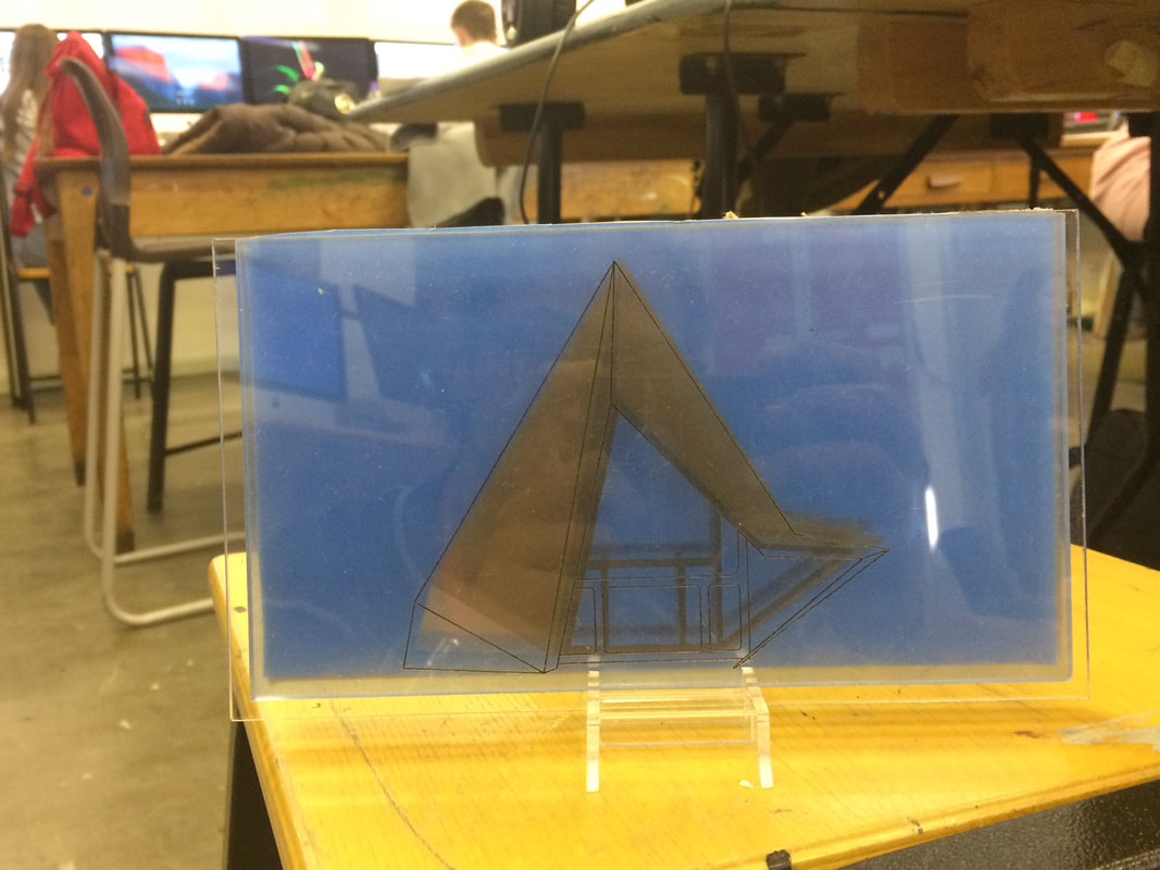
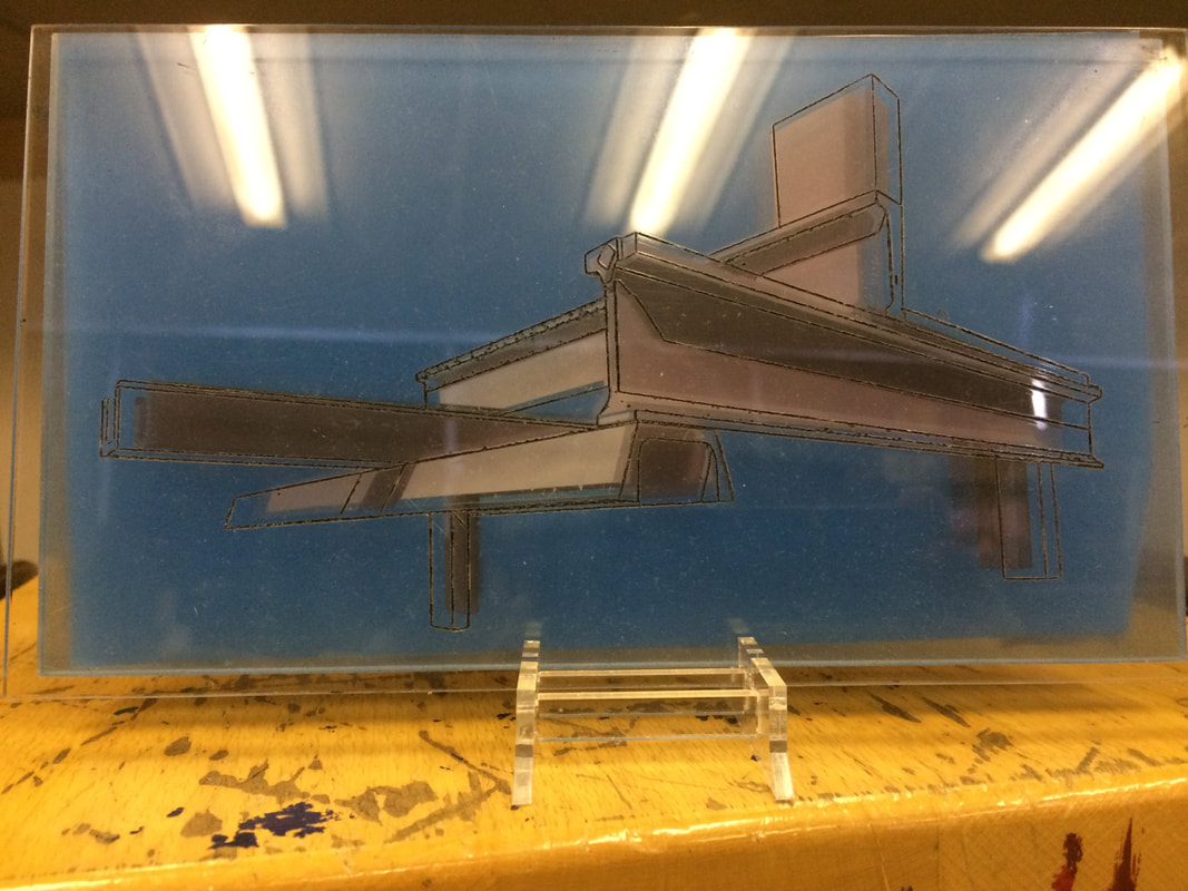
I ended up making the laser etched one go in front, to show off the bold characteristics of the structure. I then spray mounted the acetate onto another piece of acrylic, this time without etching. Last, at the back, I had the images printed on paper, and then glued them to double layered card. Overall, when layered up, it created a surreal and holographic design, that very much complements the structure of the building and the process of making the piece.
WWW > I think that everything turned out to my liking, and the laser etching went even better than expected. I have made this in this specific stand so it can be observed in many different ways. Lights can be added in the future, and if so, even more and more, to make it even better.
EBI > I ended up with the pictures not exactly lining up, but that is due to the softwares. If there were anyway possible to line it up perfectly, I would be all for that. It was the only thing about the piece that I did not like. It is, however, a small inconsistency, that can be seen as 'Artistic Impression'
The Original photos are below